https://www.mfractor.com/blogs/news.atommfractor - News2023-04-17T08:30:56+10:00mfractorhttps://www.mfractor.com/blogs/news/introducing-ansight2023-04-17T08:30:56+10:002023-04-17T15:41:23+10:00Introducing AnsightMatthew Robbins
Use Ansight to record, replay and analyse testing sessions of your Android apps. No SDKs, code changes or developer tools needed. Fully plug and play. Framework agnostic.
]]>
I've been a little quiet this past year and it's been for a good reason... I'm very pleased to show off the newest addition to my little product family, Ansight!
Ansight is a macOS application for monitoring, capturing and replaying the runtime behaviour of your Android apps.
Backstory
In early 2021 I was building offline mining software that ran on Android devices, trying to diagnose memory related bugs that occurred only after long periods of app usage (2+ hours).
Trying to work out the steps that led to these slow leaks was very difficult and required trawling through huge ADB logs, hunting down the core actions a user performed.
This led me to wishing for a tool that could do the following:
Make it easy to capture and filter ADB logs for a specific app.
Capture all device and app details. This would eliminate the "Oh but what version of XX were you running" conversations.
Capture a screen recording and allow me to correlate ADB logs to what was happening on screen.
Capture app memory usage and correlate it to ADB logs and the screen recording.
Did not require the use of ADB via the command line or Android Studio (both fantastic but highly technical). The tool needed to be plug and play and require minimal technical know-how to make life easier for software testers.
When you're investigating a bug, do these questions look familiar?
What device were you using?
What app version were you running?
Did you grab any logs?
Did you grab a screen recording?
What did you do leading up to the problem?
Wouldn't it be nice if, instead of that conversation, it was simply: XYZ happened, here's the capture for the issue.
And so, in typical developer fashion, I decided to build a tool to do this!
Ansight is super easy to use
As mentioned previously, maybe the single most important goal for Ansight is that it's dead easy to use.
Testers, engineers and product people should be able to plug in a device, record captures and then replay those captures very, very easily. I want the conversation to be about how to solve a bug, not how to capture the information about the bug.
After downloading and starting Ansight, enable developer mode on a device and plug it into your computer. Ansight immediately connects and shows you the logs and screen for the device.
Simply put, Ansight is plug and play:
It does not require any code changes or SDK's to be added to your apps.
It does not require any app's to be installed onto a users device.
It does not require any developer tools on your computer.
It is compatible with all Android development frameworks and tools.
That last point is super important: Ansight works with all Android development frameworks. It doesn't matter if the app is built using Java, Kotlin, Flutter, React Native, Xamarin, Unity, Unreal Engine etc; Ansight uses ADB only and so is completely framework and tool agnostic!
Deep Application Insights
Ansight records a screen recording, device logs, device details, app details and app memory usage in a single replayable file (.ans).
With Ansight, you can:
View the live behaviour of a device and optionally target a specific app to monitor.
Record a device session and then replay it. Correlate application and system-level events with a screen recording.
View and filter incoming Android device logs with an easy to log viewer.
View the memory usage for a specific app.
Built With .NET MAUI + MFractor
Under the hood, Ansight is built with .NET MAUI. This has played a very important part of how I've built and tested MFractors recent .NET MAUI support.
With MAUI, I could create a tool that is a native macOS app, is extremely performant and runs on multiple platforms (a Windows version is currently in development).
A huge credit to the .NET MAUI team for their work on the platform!
You may receive an unknown developer warning when trying to run the app. If so, right click on the app and click Open.
I've used Ansight extensively with my clients this past year and it's been instrumental in capturing, reproducing and quickly fixing bugs in their apps. When we've captured a bug in an Ansight recording, we often fixed it in less than an hour; usually we would still be talking about how to reproduce it in that time!
I look forward to hearing your thoughts on Ansight, both good and bad.
Happy bug hunting! 🏹 🐛
Matthew Robbins - Creator of Ansight and MFractor ✌️
]]>
https://www.mfractor.com/blogs/news/mfractor-now-available-for-visual-studio-windows-20222022-03-18T11:27:33+11:002022-03-18T11:27:33+11:00MFractor Now Available For Visual Studio Windows 2022Matthew RobbinsMore]]>
I'm pleased, at long last, to announce that MFractor is now available for Visual Studio for Windows 2022. 🎉🎉🎉
Features And Changes
All existing features are available in MFractor for Visual Studio Windows 2022 plus some new ones.
Thickness Adornments
Thickness expressions such as Margin and Padding now have visual indicators to show which dimension a number in the expression represents:
Performance Performance Performance
This release also adds a considerable performance boost to MFractor.
MFractor no longer maintains a SQLite database of a solutions resources and now does this in-memory. This makes the initial scanning of a solution muchfaster and additionally makes any XAML resource based analyser dramatically quicker.
I predict you'll be pleasantly pleased by the plentiful performance perks!
Installation
To install MFractor into Visual Studio 2022:
In the top menu, select Extensions then Manage Extensions.
In the Manage Extensions window, select Online in the left hand list.
In the right hand panel, click into the Search text field and search for MFractor.
Select MFractor in the middle list and then click Install.
After installation has completed, you'll need to restart Visual Studio for MFractor to .
Licensing
If you have previously activated MFractor in Visual Studio Windows 2019, and the license is still valid, the activation will automatically carry over to Visual Studio 2022.
If you have an existing, valid license key for Visual Studio Mac, this you can use this license in MFractor for Visual Studio Windows 2022. Simply follow the installation steps above then activate MFractor with your license key when prompted.
Summary
MFractor is now available in Visual Studio Windows 2022 with all existing features, some new features and a big performance improvement.
Your valid existing licenses will either carry over from Visual Studio 2019 or can be used to activate MFractor in Visual Studio 2022.
I'm super excited that MFractor is now supported in the latest and greatest Visual Studio and am looking forward to adding support for Visual Studio Mac 2022 plus MAUI!
]]>
https://www.mfractor.com/blogs/news/net-6-for-mac-with-apple-silicon-developers2022-01-20T11:31:48+11:002022-01-20T11:31:48+11:00.NET 6 for Mac with Apple Silicon DevelopersRafael Veronezi
Microsoft released .NET 6 with a great focus on the availability of its runtime and SDK compiled natively for the arm64 architectures of Apple Silicon Macs. This is exciting news but, its just half of the history. When it comes to the developer side the native promise is still lacking decent tooling support.
This post is an attempt to document how I've setup my environment on a MacBook Pro with an M1 processor, trying to circumvent all the pains of being such an early adopter. 🤕
The Problem
Visual Studio 2019 for Mac doesn't support .NET 6 on Apple Silicon Macs at all.
This doesn't affect existing workflows like working in previous versions of .NET (5 and Core 3.1), and you can still setup your environment to work with your existing projects, like explained here and here.
The arm64 of the .NET 6 SDK can still be installed and used to compile new projects. The limitation here is around the tooling support. When you install the latest SDK you should get this banner message on your IDE:
Clicking on the button leads you to a support page with a cryptic message:
On Apple Silicon machines (also known as M1 or ARM), Visual Studio for Mac 8.10 does not currently support the .NET 6, .NET 5 and .NET Core 3.1 x64 SDKs released in November. It also does not support the .NET 6 Arm64 SDK. If any of these are installed, then they will break Visual Studio for Mac 8.10, and should be uninstalled, and the older .NET SDKs installed.
This is misleading and very confusing. Worst yet, the proposed solution is to uninstall all the SDK's and just install the latest ones without .NET 6. As I made it clear at first, .NET 6 is not supported on Visual Studio 2019 at all, even if you install the x86 version of it! But that shouldn't inhibit us from using the SDK from the command line with Visual Studio Code or other supported IDE.
The thing is, there is a workaround this issue. You can still have Visual Studio working correctly with previous versions by setting up the SDK Locations like below:
That should put you on a supported scenario where you can still work with your existing projects that you hasn't updated to .NET 6. The limitation is that you won't be able to work on those newer projects (and you will still get the annoying banner every time you open up Visual Studio).
Visual Studio 2022 for Mac Preview
While Visual Studio 2022 for Windows was released along-side with .NET 6 last November, its macOS counterpart is still in a very early Preview. Microsoft has decided to do a huge refactor to the IDE migrating several parts to native macOS code which will allow full arm64 support, but it will still take a bit longer until a stable release. Since the Preview 3 it added support to .NET 6, but you had to pick if you wanted it to work with the newer or the former versions, as described in the release notes:
On Apple Silicon (M1 or Arm64) machines, the .NET 5.0, 6.0 and .NET Core 3.1 x64 SDKs, released in November, are not supported by Visual Studio for Mac 17.0 Preview 3. This is because the new x64 .NET SDKs install into a different directory and Visual Studio for Mac currently only supports the original .NET SDK install location, which is now only used by the Arm64 SDK.
If .NET 5.0, 6.0 or .NET Core 3.1 x64 SDKs are installed, then these should be removed, and the .NET 6 Arm64 SDK installed instead.
Learn how to migrate to .NET 6 Arm64 SDK with these instructions.
Visual Studio for Mac 8.10.13 and earlier versions are not supported side by side with Visual Studio for Mac 17.0 Preview 3.
This is once again confusing and misleading, but I've decided to try things out and I've found that as of the Preview 4 I was able to either run it side-by-side with 2019 version and to fully compile and run a solution that mixed projects for different SDK versions (Core 3.1, 5 and 6), although there wasn't any words about it on the Release Notes.
This sounds like a workaround and Microsoft seems to be heading to add the desired support for the former versions of the SDK, but we can't lose from sight that Visual Studio 2022 for Mac is an early Preview and does not yet have several features and workloads already available in the 2019 version. As its still in preview, we don't recommend it as your primary development tool but we expect that to change once it is fully released.
It's never been easy to be an early adopter! 🤷♂️
Using JetBrains Rider
JetBrains has been gaining momentum as a preferred IDE for .NET developers beyond the confusion that Visual Studio for Mac is in its current state. Its most recent version is fully support on Apple Silicon Macs and is already using .NET 6 as its backend.
It is possible to use Rider for either former and the latest .NET releases. The tricky is to select the proper version of the CLI tool on the Preferences:
This can be set per solution, which means that you won't be able to mix current and former versions on the same solution, but with a bit of organization on your project structure it works pretty fine! So depending on your workload (and your will to spend on buying a Rider subscription), it may come as a good alternative if you're on such scenario.
What about MFractor?
MFractor runs on top the Visual Studio engine and is supported on Visual Studio 2019 for Mac. The current preview of Visual Studio 2022 is lacking extension support, so we are unable to provide an updated version that can support you on .NET 6 projects. We'll be working on an update as soon as Microsoft adds extensions back to the product. In regards to Rider, there are no plans for supporting it at this time, so if you stick with Visual Studio 2019 for Mac for now you should be good to go.
Summary
The release of .NET 6 represents an important milestone for developers who prefer macOS as the first to support a native runtime and SDK for the Apple Silicon processors. Yet, there are issues and flaws related to the tooling that should be addressed overtime. We're just in the middle of the expected 2 year transition to the new architecture and a lot has evolved. The thing is, there's no turn back when it comes to processor architecture on Apple systems, but early adopters always pay the price.
I hope that this post may shed some light on developers who have gone all-in like me to the new system, and needs to setup its environment properly. Please share your comments if you find anything that I've might have missed.
When developing apps you'll come to the point where you'll need to deal with image assets. No matter how crudiest the UI could be, you'll probably need some icons or small image resources to compose your layouts. In this post we'll explore how image assets works on iOS.
The Problem
You might ask, why do I need to care about image assets? Aren't they just plain images that I render on my layout? It used to be that simple, but not anymore. But what are the problem with they so? Well, a little history will make things clear.
When Apple launched iPhone in 2007 they set the landscape for the "glass" shaped smartphones where we are today. A screen of 3,5` with 240x320 resolution was a big deal. Smartphone displays of that era was crappy, ugly and pixelated. The iPhone display by contrast was very sharp and beautiful. For developers the fixed resolution made it very easy to design for iPhone in that very early years, and everyone was happy. 😌
But enough is never enough, so circa 2010 we've got iPhone 4 and its retina display that doubled the resolution keeping the same screen size. The idea was that with such high res you couldn't notice the spacing between pixels and rounded edges would be naturally smooth.
That bump on the screen quality was very impressive and had a very good customer reception. But it comes with its own issues to developers. To take advantage of such high resolution our apps needed to adapt the layout of the apps and provide images that doubled its own density or they would look so small on the screen that would be impossible to interact with. Software upscaling was possible, but wouldn't produce that sharp edges that users were looking for.
And Apple, being Apple, started sometime to force apps to be compatible with the retina display, otherwise they would be rejected on the review. There was no escape for developers!
This is when image asset management hell was the born on iOS projects! For now own we needed to provide variations of the same image to match with the screen resolutions. Then came iPhone 6 Plus, that trippled the resolution, iPads, Retina Display Macs and, well, you got the idea...
Of course that tools were created to help with this new problem. They're what this post is about! 😎
Understanding Screen Densities
Given our problem space, let's learn about screen densities! But first there is a few concepts to recall:
Screen Size: referes to the physical size of of a screen that's normalized measured by its diagonal inches. The screen size by itself normally don't specify its aspect ratio (the ratio between its width and height that defines its actual dimensions).
Resolution: refers to how many pixels we have on a given screen. They are defined by how many pixels we have on the horizontal axis (the width) by the quantity of pixels on the vertical axis (the height), which forms a matrix. The amount of pixels on a given screen is the product of this two numbers. A few examples:
The original iPhone had a 240x320 screen resolution, with a total of 76800 pixels
iPhone 4 had a 480x640 screen solution with a whoping 307200 pixels!
Density: the density of a screen is the relation between the phyisical size and resolution. Its normally measured by ppi, or pixels per inch, that is the quantity of dots or pixels that fits into an inch of that screen. The higher the density the better the quality of the image because with more pixels the image can more detailed.
So in the example above either the original iPhone and the iPhone 4 had an 3,5' inch display. While the original has a 165 ppi, iPhone 4 had an stunning 326 ppi!
But what does this means in practice? A picture still worth a thousand words (no pun intended)...
The image above was taken from the article "Real retina vs. non-retina photos" and is the magnified photo of two Mac displays. On the left we have an image presented of the non-retina one. We can see that there's a lot of spacing around each of the dots that compromises the image quality.
On the right we have the same picture presented on a retina display. This is a screen that has the same physical size of the left one but the resolution is doubled. We can see that the spacing aruond each pixel is much smaller, producing a higher quality image with much more details. The rounded edges are a lot smoother, as an example.
The picture above is a close-up. We normally don't use a screen to close to our eyes to see it in that detail. So in effect when using a retina display you shouldn't be able to notice the spacing around pixels. The trick is revelead! 🪄
Historically developers of graphical interfaces always thought of developing UI's based on the screen resolution alone, and this was also true for the first generation of iPhones. We had a single device and it had a single display size and resolution where we draw our elements based on that available space, by doing simple calculations and rendering on absolute coordinates. With the introduction of retina displays we had a new higher resolution to cover which would immediatly break compatibility of our app with the new device.
The important thing to note is that increasing the screen resolution is all about image quality, as we show above, and not giving more drawing space. The iPhone 4 display had the same physical size but doubled the resolution so where we had 1 pixel now we had 4 pixels in the same space allowing us to represent much more detail.
But wait, what?! You told me that it's the double of the resolution, how do we have 4 pixels to 1 ratio? I'll try to picture that for you:
Let's pretend that the image above represent two slices of the same physical size, one cut from an original iPhone and the other from an iPhone 4. Each square represents a pixel, and its easy to see that where there was a single pixel on the first now fits four of them. Since we doubled the resolution on each axis we actually have 4 times many pixels than the previous generation. Another way of seeing it is that we can fit 4 screens of the original iPhone on just one screen of the retina display.
When running our app on a retina display we want to keep the UI elements with the same physical size and its just a matter of doubling the size of the elements themselves. But we don't want to manage different sizes for different devices. This seems the kind of problem that can be solved by software, and this is exactly what the point measure does.
Starting on iOS 4, Apple updated the whole UIKit library to start using the Point measure instead of pixels. This abstracts away our concerns about the density of the screen. From the developer point of view, he was still working with a canvas of 240x320 points. It is now up to UIKit to decide the actual size of an element depending on the device that the rendering is done.
Ok, so this is quite a lot to grasp! 😓 And I myself took a long time to make a sense of all of this. But now we can advance to talk about images at least...
Types of Image Files
Have you ever asked yourself how computers represent images? Alghouth this may be some basic knowledge to most developers, it's a good theme to revisit. When it comes to modern computer graphics there are two main ways of representing the images: bitmaps and vectors.
Bitmaps
Bitmaps are just a matrix of rows and columns where each intersection is painted with a color. Bitmaps are best for representing pictures and highly detailed images, just like this one:
Well, its not a masterpiece but I hope it made you smile! 😆 I found it to be very representative of what a bitmap is. Of course its just a black and white image. But turning the bits into bytes let us represent a wide palete of colors for each pixel. Here's an example:
The image is a reproduction from Adafruit authored by Carter Nelson. Here each pixel represet a number and by applying a pallete, which maps each number to specific color, we now produce a colored bitmap. The higher the number the most colorful the image can be.
Here we can also see that bitmaps has a fixed width and height, which represents its big downsize. Nowadays we have very good algorithms for shrinking or enlarging bitmaps, but there's always some loss.
Vectors
Now we come to the vectors, which are more cool to programmers! They're are a mathematical representation of the shapes and glyphs that forms an image. This means that they can be easily scaled which make them very desirable for the responsive designs that we strive to produce in web and mobile apps.
To better understand vector images lets dirty our hands (just a little) of code. PaintCode is a drawing app like Sketch or Illustrator where you can make your designs. What makes it different is that instead of saving it to a file, PaintCode generates the code necessary to draw your image on screen with UIKit.
There are similar tools available for other platforms and UI engines.
Take a look at this screenshot from the app tutorial:
Notice that we have a canvas and below it a code section.
The code itself is not important, but I want you to get a sense that it represents a series of instructions on how the image should be draw. In this example the image has a fixed size, but notice how we can easily introduce variables to resize it as you need, which will preserve its sharp quality.
This is the power of vectors!
There's a lot of debate around which type is better, and, as always when it comes to software engineering, the answer is: it depends! Each representation has its pros and cons and you should evaluate your usage scenario and requirements to take a better pick.
Generally speaking bitmaps are usually better for photography or highly detailed images where vectors deals better with shapes and abstract drawings.
Always check with your designer, they usually now what's best! 🧑🎨
Representation vs. Storage
The discussion about bitmaps vs. vectors is all about how to digitally represent an image, but when it comes to storing that images it's a completely different story. Either bitmaps and vectors can be stored in several different file formats. This is because the way we represent this image as a data structure is not necessarly the best way to store it.
For instance, to save a plain bitmap to a file we need to store the color of each pixel in a matrix which is very wasteful. The most common formats for saving bitmap images are PNG and JPEG which employs compression algorithms to greatly reduce its storage size.
When it comes to vector images, the most common format is SVG (Scalable Vector Graphics), an open standard that emerged with web and spread through most platforms, which is just a plain XML file. Here's the content of a simple SVG for an information icon:
Notice that you can easily modify this file to change it's "viewbox" (the size of the canvas), the width and height or the fill color. More adventurous people may want to mess with the path coordinates, but I think its better to have some image editor for that. Below we can see the actual image:
Notice that although its 18x18 pixels in size we have a applied a 500% zoom and there were no loss in the image quality.
Tip: Gaplin is very useful free tool for macOS to with SVG files. It has a decent previewer and an exporter to save as PNG or other common image formats.
There are several other file formats such as EPS (Extensible PostScript), AI (from Adobe Illustrator) or PDF. Although vectorial images are usually associated with shapes, each of those formats allows you to describe more complex types of elements such as texts and even embbed bitmaps inside a document.
Vectorial images have a very rich and interesting history that dates back to the PostScript language, the most popular effort to create a standard for describing documents for printing. This has evolved until our modern standards that allows us to store rich image assets in a very optimized way.
Understanding those differences about image types and their storage is key for organizing the image assets of your project. Also this will allow you to communicate better with the design team.
Understanding iOS Image Assets
The iOS SDK supports, out of the box, several types of image formats and has built-in API's to handle loading and rendering of those assets. On this post we will keep our focus on the UIKit framework. There are other low-level API's to directly manipulating image files or working with different formats and other kind of tools for frameworks like SpriteKit for high-performance graphics.
On the previous section we've presented why image management became a basic subject of app development with the introduction of Retina Displays. With this we had to deliver different versions of the same image. But the density is not the only the only thing we must take into account for modern apps. Let's break down some of variations that an image asset can have:
Variations for specific devices (Apple Watch, iPad, Apple TV, carOS, etc)
Direction (LTR or RTL depending on the language)
Width and Height classes (for use with Size Classes)
Light and Dark themes
Localized imagess
There's also other variations that are so specific that it's not worth mentioning, and to be fair, I personally never got beyond density, theme and localized images. The important thing about variants is that the iOS SDK has some clever API's that automatically select a variation for a specific context.
With this basic understanding of variations let's explore how they can be organized and used inside our iOS projects.
Bundle Resource Images
This is basicaly plain image files. Adding this kind of image is much like adding any regular file to your project. For Xcode projects just drop your image into a group and ensure that its added to your target:
We call it "Bundle Resources" because they are copied to the application bundle. Take a look of the contents of the application package produced by Xcode and noticed how the files is copied to the root of the package:
Although Bundle Resources being just regular files copied to your application package, Apple added a few tricks to it to deal with the density issue we've seen above. Have you noticed the other two files with the odd suffixes? Let's understand what it is about.
File name suffixes
Remember that to deal with multiple resolutions we have to provide different versions of the same file. Those versions are called variations. This as a mechanism that allows iOS to automatically select the best image for a given density based on some conventions.
The suffixes on the file name are used to identify the density of the image so in the example above we've provided 3 variations of the MFractor logo image and appended the @2x and @3x suffixes to identify the screen density to which it corresponds.
Let's put them to use, here a sample design:
Its far from being a design masterpiece but enough for our purpose. The Logo image is a 250x297 points in size. As we've told before, points is a base measure that is automatically scaled upon the actual screen density. Let's summary the variations we've provided:
mfractor_logo.png - 250x297: this is the basic image size and suits iPhones prior to 4 and iPads prior to 2.
mfractor_logo@2x.png - 500x594: this suits the first generation of retina displays that came with iPhone 4 and above and most of the iPads
mfractor_logo@3x.png - 750x891 (@3x): this fits most of the modern iPhones and was introduced with iPhone 6 Plus that had a very high density screen
Important: Notice that the scale factor 1 refers to devices that are retired for almost a decade by now so in practice we don't use it anymore.
Using densities suffixes makes it a lot easier to organize and handle our files. Having the images named like that on your project is sufficient for UIKit to make the call on which image to load and render on the screen, as long as we don't add the suffix when referencing the image file name. It keeps track of the density of the device where your code is running and automatically select the preferred image.
Asset Catalogs
The Asset Catalogs was introduced some time later to aid on organizing and browsing through those image assets. Catalogs are pretty much folders where files are organized in a specific way with some additional metadata and Xcode provides a special UI for managing the assets of that catalog that looks like the following:
There's a lot to learn from the screenshot above, let's check it out:
This navigation area lists all the assets on this catalog.
When an asset is selected we can edit its variations on the main editor.
The Attribute Inspector allows us to edit all the characteristics of this particular asset.
In this example the selected asset is our logo image, identified as an Image Set. This distinction is important because catalogs supports several other types of assets as we can check on the Add menu:
Here we can see that catalogs is not just about images, but other kinds of assets like Colors and even Data Sets that are pretty much any kind of data file that you may wish to have organized on a catalog. But all those other types of items in the catalog is subject of another post, lets focus on the Image Sets.
Its important to note that an Image Set represents a single image, and in code we only reference it by the name of the set itself. Generally you don't ask for a specific image of the set, this is decided automatically based on the attributes and on the images available, so if you've setup your catalogs correctly you can expect it to work it automagically!
Dark and Light Themes
In the previous sections we've examined the density aspect of an image, but over time another kinds of variations has emerged and the Asset Catalog proven to be very useful to support those new capacities. Probably the most useful of them is the Dark and Light themes support. If you check on the Attributes Inspector (item 3 above) you can see a option for Appearance. The following options are available:
Since iOS 13 users can choose between light and dark themes as an environment setting. Our apps are expected to respond to those changes and adapt the interface to include a dark appearance. Supporting dark themes greatly enhances your user experience because it allows users to adapt their usage to their lighting conditions. Dark themes are very confortable to use on low light environments.
For the developers this means that they must include versions a dark variant of most images to adapt or correctly contrast with the darker colors. Asset Catalogs makes this very convenient by allowing you to specify dark versions of the same image. On the Appearance attribute select the Any, Dark option and a new row of boxes will appear for us to fill:
Notice the added row of Dark Appearance images. They're equivalent to the top ones but they will be selected by UIKit once the user changes to Dark Theme system wide. Better than that, all the images will be automatically reloaded to match the new theme. This is the power that Asset Catalogs brings to us. But wait, there's more!
App Thining
Having multiple versions of the same image on a project introduced a new problem. The size of your app incresed substancially because it needed to support those multiple devices, but having a image that is never going to be used is a waste of storage and network traffic.
App Thining was introduced as a set of features designed to reduce your app size. It creates several variants of your App Package optimized for specific devices and delievers those
When it comes to image assets App Slicing is the one that has more interest to us. There's also On Demand Resources, which allows you to create sets of images that can be downloaded on demand, but I will skip talking about it for this article. 🙂
The third feature of App Thining is Bitcode, which allows your app to be recompiled by Apple on the server to generated optimized versions of it. This is a interesting feature but is out of the scope of the subject of this article. Take a look at the docs for more information.
App Slicing is a server-side feature provided by the App Store engine. When the user downloads your app it receives a cutoff version of the original package with the images that doesn't fit that device screen density are removed. For example:
An iPhone SE or iPhone 11/XR should receive a package that contains only the mfractor_logo@2x.png, because their screen is a 2x density.
All the iPhone 12 lineup has 3x density screens, so they should receive a variant of the package with only the mfractor_logo@3x.png.
The best thing is that this happens automatically!
PDF Image Assets
Apple introduced PDF Image Assets with Xcode 6 as an option to use vector images. The idea is that you can replace all the density versions with a single file. To use this, on the Asset Catalog select the image set that you want to use a PDF file and on the Attribute Inspector change the Scales property to Single Scale:
Notice that changing this the tool will only accept a single image input for each device that you may select:
Although this greatly simplifies file management, using PDF assets may be misleading. When introduced it was more of a Xcode tool than an UIKit feature. It works at compile-time by transforming the PDF into PNG versions of each supported scale, which is not a bad thing, but has it issues.
The thing is that PDF may mix Vectorial and Bitmap parts which leads to odd results when resizing. There's also issues with exported masks and gradients. There's a very interesting article named Why I don't use PDF's for iOS assets that is a must read if you're considering using PDF's.
Later on Apple added the Preserve Vector Data option to the Image Set with Xcode 9. With this option checked the actual PDF is bundled into the application package and this scaling is done at runtime. This allows us to benefit on vector for upscaling an image for example (by override its intrinsic size), but suffers from the same issues presented above.
Despite of those drawbacks PDF assets are an useful tool on your toolchain, so doesn't just drop it. Keep in mind the stuff above and it should be helpful.
Vector (SVG) Image assets
Well, this is the fancy name for SVG support. We have already talked about it on our discussions of image representations. SVG's are largely used on the industry. Browsers supports it natively (you can even embbed it into HTML) and Android has been using it for so long, so I don't understand why it took so long to have a native support within Apple platforms.
To use SVG's on your Asset Catalog is pretty much the same setup for PDF by selecting Single Scale for the Scales option, but instead you drag an SVG to the Image Set:
Here we've added 2 new image sets for an email and password icons that we've got from the Material site (!!todo get links). We've just set it as Single Scale and dropped the SVG files on the catalog. This is pretty much what you need to do to use SVG's in your code.
SVG's are a very welcome addition to iOS but unfortunately its only available from iOS 13 and above (and only when using Xcode 12), which means that you may wish to stick with PDF's or plain images for some time if you need to support versions prior to that.
SF Symbols
Apple introduced SF Symbols with iOS 13 as a set of built-in high quality icons on top of the San Francisco Font. Using SF Symbols to provide icons for your apps has several advantages:
Symbols are high quality vector graphics that can scale to multiple sizes
They are built into the operating system and doesn't add any overhead
They don't need any extra setup, just reference the symbol by name and use it on your screen
They are the same glyphs used throughout the operating system itself so using them provide a consistent experience to the user
It's a very convenient for stand-alone developers that doesn't have much design resources
There are more than 2400 symbols to choose and they've also introduced some multicolor ones. You can download the ]SF Symbols App](https://developer.apple.com/sf-symbols/) to browse through the entire catalog and get the symbol names (that is what you use to load them on your code). It allows you to create custom collections for the icons that you use on your apps.
There's nothing much we can say against SF Symbols, except that its only available from iOS 13 and that new symbols are being added as each new major release is made. You may also want to avoid it if you need to create a consitent identity across platforms, since its not available to Android or other OS'ses.
Using Image Assets in code
The iOS SDK makes it very easy and convenient for us developers to use our image assets in our code. Most of the time it is just a matter of referencing the asset from its name, so having good standards for naming your assets is a good help.
Loading images is mostly done through the UIImage class. It has several initializers that allows loading images in different ways from different sources, but the most common is the init(named:),
Here are some rules, if you're loading from:
Bundle Image Resources: use the name of the file without extension and without the density suffix (@2x, @3x, etc.), that way the variant that best fits will be automatically selected for you.
Images Inside Asset Catalogs: use the name of the image set that you want to load.
Other sources, explore the UIImage docs to check all the possible ways of loading an image, like an in-memory binary representation (NSData) or even from other bundles.
Let's bring some examples on how you can do it using different SDK's.
UIKit and Xamarin.iOS projects
The UIKit is the classical iOS interface development library. Images are loaded through the UIImage component and presented on the screen with the UIImageView. If you're using View Code here's a snippet for presenting an image in a Swift Playground:
let image =UIImage(named: "mfractor_logo")
let imageView =UIImageView(image: image)
Pretty simple two liner!
Xamarin.iOS is a just a wrapper around UIKit, the same code in C# would be:
If you're using XIB's or Storyboards you can add an UIImageView component to your layout and set image property on the Attribute Inspector:
Notice that the dropdown will show the images available on your project.
SwiftUI
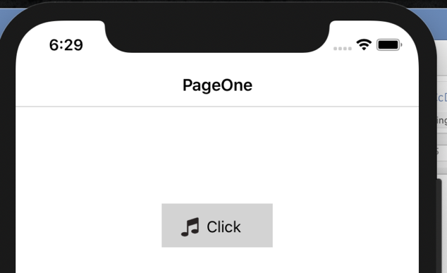
If your project is using SwiftUI all you need is the Image() passing the name of the asset as of the rules we've set above. Here's a snippet from our sample app:
This declares an icon to illustrate the purpose of the text directly beside it. Here's the full screenshot of this implementation:
The Image() component has a few overloads of its initializer that allows you to load images from different sources, but any further customization is done through the modifiers. Take a look on the code of the image that declares the devices image:
The devices asset is a PDF image that is very large (more than 600 points), so in order to make it fit better our purpose we have made resizable, used scaleToFit to make it resize proportionally and set its frame to 200 points, making it fit better on the actual screen.
Last but not least, suppose you want to replace the icons images with SF Symbols. You just use a different initializer with the systemNameargument, such as:
In Xamarin.Forms we present images with the Image component like so:
<ImageSource="mfractor_logo" />
You can simply pass the name of the asset you want to load to the Source property as of the rules we've set above. This works because on the covers there's a UIImageView, so the Xamarin.Forms encapsulates the same calls on the UIKit section.
MFractor Image Tools
MFractor has a set productivity tools for Image management. It aids developer on importing, maintaning and referencing images on Xamarin projects. Check it out on our Feature Matrix and get to know everything it haves to offer.
Summary
Working with images in mobile projects should be a common and trivial task, but has its specificities that we should be aware of when it comes to screen densities. Also, other kinds of image variations has been introduced over time, like the Dark and Light Themes.
In this article we've introduced this problem from the point of view of the iOS developers, but Android developers falls in very similar issues (with similar solutions), and maybe we can talk about it on another post. Leave us a comment and let us know if you find this content useful and wants a similar approach for Android.
In closing, I'm leaving a few references for this subject so you can take a deeper look into the subject:
Rafael is a brazilian Software Engineer who have worked across several development stacks and settles its passion on the Mobile Development as an Architectect on native iOS and Xamarin projects, and works as a developer of the MFractor. During the last decade he taught several courses on mobile development on his home country and is passionate about learning and teaching technology.
]]>
https://www.mfractor.com/blogs/news/previewing-xaml-uis-in-xamarin-forms2021-01-13T15:27:14+11:002021-01-14T01:18:17+11:00Previewing XAML UIs In Xamarin.FormsRafael VeroneziMore]]>
XAML Hot Reload and Previewer
Building UI's has always been a hard job. Modern apps tends to use complex designs and need to adapt to the growing number of device sizes and form-factors. The most established front-end development workflows are based on transcribing designs based on static images to the components that actually render that screen at runtime.
For the Xamarin.Forms developers, UI's are written entirely in code, either through XAML or C#. This allows developers to have full control over the rendering of the interface and split it into reusable components, but comes with drawbacks.
Its hard to write UI code without seeing its actual output. Drawing UI from an application framework is not like composing it on a tool like Photoshop by drawing and styling primitives (although its possible through shapes). As developers we think of UI elements as dynamic components and interactive components.
Writing a complex UI is for the most part a trial and error exercise. Commonly you do several roundtrips between edits to test every dynamic and interactive aspect of the interface. Lucky as Xamarin.Forms developers, we have some great tools to facilitate this jobs:
XAML Hot Reload: allows us to make changes to change XAML code and have it updated on a running instance of your app, either on a simulator or a real device.
XAML Previewer: is a tool built to Visual Studio XAML editor, that allows us to have instant insight on the UI that you're working.
Let's take a look at them!
XAML Hot Reload
The XAML Hot Reload feature takes changes to a XAML file and instantly updates it in our running app. Hot Reload allows us to avoid the expensive roundtrip of building and deploying the app to test UI tweaks, lettings us preview it directly on a device (which is the best method for testing our UI work).
As changes made to XAML files are instantly updated in the running app, in practice Hot Reload makes the simulator a kind of real-time previewer.
Using Hot Reload
If you've updated to the latest versions of Visual Studio and are working on new projects, Hot Reload is mostly "there". Let's give it a try! Open Visual Studio and create a new Blank Xamarin.Forms project. I'll call itHotReloadDemo. After creation just run the app on the simulator.
This is the design of theMainPage.xmlfrom the Blank project template. Open the file on the editor while you keep the debugger running and let's change the header to a red background. Save the file and see the "magic":
After saving the file the page was refreshed with the changes you've made. You can keep doing changes to this file, and when you're happy with them just save it to have it deployed instantly to the running app. Let's try to change the entire page layout, replace the inner of theContentPageelement with the following:
<GridRowDefinitions="*,*"RowSpacing="0">
<!-- Top half - The chronometer -->
<BoxViewColor="Red" />
<LabelVerticalOptions="Center"HorizontalOptions="Center"FontSize="80"TextColor="White"Text="01:30" />
<!-- Bottom half - The controls -->
<BoxView
Grid.Row="1"Color="Brown" />
<Ellipse
Grid.Row="1"WidthRequest="180"HeightRequest="180"VerticalOptions="Center"HorizontalOptions="Center"Stroke="White" />
<Button
Grid.Row="1"VerticalOptions="Center"HorizontalOptions="Center"FontSize="Title"TextColor="White"Text="START" />
</Grid>
This is a roughly and incomplete re-creation of theInterval Timerapp main screen. It's not meant to be perfect, just to give us an entire new interface. Please be mercyful with my design skills...🙂
So, when you save the file, you should see that after a flash the whole content of the screen will be replaced in the running app.
You can keep doing this until you're satisfied, then you get to your next design subject. Hot Reload is smart enough to identify custom views and keep them updated as you edit, which allows for example to change the layout of a Collection View cell on it's own cell file and having it updated on the running app.
In the following example I've created a custom view to represent the control panel on the bottom of the screen (fileViews/ControlPanel.xml):
Try changing something on the nested view and see it being propagated to the simulator!
Note:I've kept the code for the views as simple as possible to focus on previewer experience. It by no means represent real production code that I would add to a project.
By default, Hot Reload will refresh the entire page no matter how simple is the change. There's a featurecurrently in previewto refresh only the changed view. You can set it on the Visual Studio Preferences:
Finally, Hot Reload can be used on iOS and Android projects simultaneously. Create a run configuration to start both projects on debug, now you can put the iOS simulator and the Android emulator side-by-side and review how your changes apply on both platforms:
In the example above I've added the code for a Stop button to the right of the panel. Here's the code:
Notice we're using theEllipseView from Shapes feature of Xamarin.Forms 5. We'll be covering it in a future post.
XAML Hot Reload is available on Visual Studio for Mac and Windows starting on the free community tier. Actually its not tied only to Visual Studio as is much more a compiler/debugger feature, making it available on JetBrains Rider too.
As good as Hot Reload could bethere are still some limitations. Its available only to Android and iOS, and some scenarios will require rebuild and redeploy.
Previewer
The XAML Previewer is a built-in tool in Visual Studio that shows a real-time representation of the XAML content that you're working on your main editor. It was the first integrated tool to aid developer on designing Xamarin.Forms Pages and Views.
The Previewer is available while editing XAML files. To use it just open a XAML file and on the bottom tab switch betweenPrevieworSplitviews:
While in split mode, you can choose to preview for iOS and Android, and change between some device screen sizes and orientations. Then you can edit your code to have its preview updated in real time:
The Previewer is a fine tool and it's been serving us well for some years, but now it's officially beeing phased out (check out the warning on itsdocumentation page) in favor the XAML Hot Reload.
Visual Studio is already suggesting using Hot Reload instead of the Previewer:
Summary
XAML Previewer and Hot Reload are great tools to aid Xamarin.Forms developers on composing their UI's. I'm personally sad about the discontinuation of the Previewer by its convenience, and Hot Reload should serve us pretty well when its gone. I suppose they're laying the ground for MAUI that will more officially supported platforms out of the box.
Hot Reload should evolve overtime. There are some preview features like reloading only changed parts and stability improvements. Also I hope that they've come to support refreshing C# code also. This would open the tool for scenarios like C# Markup. We'll keep watching!😎
About The Author
Rafael is a brazilian Software Engineer who have worked across several development stacks and settles its passion on the Mobile Development as an Architectect on native iOS and Xamarin projects, and works as a developer of the MFractor. During the last decade he taught several courses on mobile development on his home country and is passionate about learning and teaching technology.
]]>
https://www.mfractor.com/blogs/news/embedding-a-javascript-interpreter-into-xamarin-apps-with-jint2021-01-05T12:46:29+11:002021-01-05T12:54:07+11:00Embedding a JavaScript Interpreter Into Xamarin Apps With JintMatthew RobbinsMore]]>
Adding JavaScript support to your Xamarin.Forms app.
Introduction
Over the years I've built Xamarin apps, I've seen multiple reach a point where they need to update business logic without republishing. This concept is loosely known as "code push", the ability to change an apps behaviour without the hassle of the app stores.
Some of the use cases for code push could be:
Update business logic that changes frequently without redeploying the app.
Let customers script and customise parts of the apps behaviour via an in-app API.
Implement a calculation engine, such as an Excel formulas engine.
While each of these problems could be solved with some clever software engineering or commercial libraries (and I've seen it done many times!), it would be ideal if we could write this dynamic logic as code that our app could execute.
Unfortunately, as Xamarin/MAUI compiles into IL or machine code (platform dependant) and bundled into a package, we cannot dynamically update the C# after publishing. Fortunately, Xamarin/MAUI is part of the .NET ecosystem and has access to a massive amount of libraries.
Jint - A JavaScript Interpreter For .NET
Jint is an open source Javascript interpreter for .NET that provides fullECMA 5.1 compliance. It can run on any .NET platform, including Android and iOS and is available as a NuGet package. Jint gives our app it's very own JavaScript interpreter!
Jint can operate within a sandbox, or with limited visibility into our apps environment or with full access to the .NET CLR.
We can use Jint to execute single expressions for a result:
C#
var square = new Jint.Engine()
       .SetValue("x", 3) // define a new variable
       .Execute("x * x") // execute a statement
       .GetCompletionValue() // get the latest statement completion value
       .ToObject() // converts the value to .NET
       ;
Or we can execute custom scripts:
C#
var engine = new Jint.Engine()
    .SetValue("log", new Action<object>(Console.WriteLine))
    ;
engine.Execute(@"
  function hello() {
    log('Hello World');
  };
  hello();
");
Jint is a fast, stable, secure and full-feature JavaScript runtime that can be embedded into our Xamarin apps. Using Jint, we are no longer constrained to only execute code compiled into our published app.
Integrating Jint Into A Xamarin App
Jint can be added to any Xamarin app by installing theJint NuGet packageinto your desired project. As Jint supportsnetstandard, this could be your core assembly or any of your platform specific projects.
To execute a JavaScript code block, we create an instance of theEngineobject and useExecute()to run a given script:
C#
var engine = new Engine();
engine.Execute(script);
To expose an object to our JavaScript during execution, we use theEngine.SetValuemethod. We could expose the current main page of the app instance to the script with the following code:
Scripts can then use all methods and properties on the object:
JavaScript
mainPage.Title = "Hello From JavaScript!"; // Changes the pages title.
mainPage.DisplayAlert("Hello From JavaScript", "This is an alert called from JavaScript", "Cancel"); // Shows an alert.
Using theSetValuemethod, we can also expose global functions for scripts to use:
C#
engine.SetValue("log", new Action<object>(Console.WriteLine);
engine.SetValue("parseColor", new Func<JsValue, Xamarin.Forms.Color>( (hexValue) => Xamarin.Forms.Color.FromHex(hexValue.AsString()));
JavaScript
log("Hello from JavaScript"); // Calls Console.WriteLine to print "Hello from JavaScript" in the console output.
mainPage.BackgroundColor = parseColor("#228811"); // Converts the given string into a Xamarin.Forms color for assignment to the BackgroundColor.
When Jint passes data back to C#, it can automatically convert JavaScript object back to their .NET counter parts. Alternatively, we can manually receive theJsValue, inspect it and then handle the conversion ourselves.
The below example uses theIsandAsmethods to inspect the type of the JavaScript value and convert it to it's .NET equivalent:
C#
engine.SetValue("savePreference", new Action<JsValue, JsValue>((JsValue key, JsValue value) =>
{
    if (value.IsString())
    {
        Preferences.Set(key.AsString(), value.AsString());
    }
    else if (value.IsNumber())
    {
        Preferences.Set(key.AsString(), value.AsNumber());
    }
    else if(value.IsBoolean())
    {
        Preferences.Set(key.AsString(), value.AsBoolean());
    }
}));
We may want to stop scripts that exceed a certain condition. For example, a script may take too long to execute, use too much memory or end up in a recursion loop. We can do this usingconstraints:
C#
var jint = new Engine((options) => {
    options.TimeoutInterval(TimeSpan.FromSeconds(2)); // Stop the script if it runs longer than 2 seconds.
    options.LimitMemory(2_000_00); // Limit total memory consumption to 2 MB
    options.LimitRecursion(10); // Limit the amount of times a function can recurse to 10 deep.
    options.CancellationToken(token); // Ends the scripts execution if the token is set to cancelled.
    options.MaxStatements(10000); // Limit the total statements a script may execute to 10,000.
});
Constraints will throw an exception when they are triggered so be sure to handle these exceptions in the code that calls the scripts.
Lastly, we can create our own custom constraints by inheriting from theIConstraintinterface and registering them with the options:
C#
public class AppIsInitialisedConstraint : IConstraint
{
    public void Check()
    {
        if (App.Current.MainPage == null)
        {
            throw new InvalidOperationException("No main page is present");
        }
    }
    public void Reset()
    {
        // TODO:
    }
}
options.Constraint(new AppIsInitialisedConstraint());
The Power Of Jint
To show what we can do by adding JavaScript support to an app, I've created some samples that allow JavaScript to interact with an app:
TheSetAppTheme.jsandSetAppIcon.jsscripts change the visual state of the app. It demonstrates custom logic, interacting with a controlled API surface, showing dialogs via JavaScript to C# interop and also handing program flow back to JavaScript by executing a script-provided lambda.
TheLoremIpsum.jsscript lets a user choose how many sentences to generate, generates it in JavaScript and then shows the result via an alert dialog. It demonstrates a wide range of JavaScript language features, implementing and executing complex logic as well as JavaScript to C# interop.
In these examples, I've exposed a globalcontextvariable to Jint; this context defines the API surface that a script uses to interact with the app. While possible to expose the whole app domain to Jint, I prefer using a custom API for interopping from JavaScript to C#. In my experience I've found this makes debugging scripts much easier (EG: set and use breakpoints within the API methods) and makes tracking down runtime errors easier also (captured stack traces show the custom API code).
Summary
By integrating Jint, we can add JavaScript support into our Xamarin.Forms apps. With an embedded JavaScript interpreter, we can write parts of our apps logic in JavaScript and through data and implement a "lite" form of code push.
To see a full working example of Jint in a Xamarin.Forms app, please find thefull source code here.
🤙Matthew Robbins
]]>
https://www.mfractor.com/blogs/news/humanising-grids-in-xamarin-forms2020-12-23T12:49:00+11:002020-12-23T12:49:00+11:00Humanising Grids In Xamarin.FormsMatthew RobbinsSpecifying grid locations by name in Xamarin.Forms for more human XAML code.
Specifying grid locations by name in Xamarin.Forms for more human XAML code.
Introduction
It's an open secret that here at MFractor we have a crush on Grids. They are one of the most powerful layouts in Xamarin.Forms, allowing us to build beautiful user interfaces with pixel perfect precision.
However, after working with them for several years, there are one or two things that we feel could be improved.
This blog is part thought experiment, part proposal with the goal of making grids easier to work with by "humanising" their syntax.
So firstly, what do I mean by "humanising"? To me, this is using syntax that makes code significantly easier to understand. I should be able to look at a piece of code and read it like a sentence, doing minimal translation in my head.
Consider theis not nullsyntax introduced in C# 9:
if (value is not null)vsif (value != null).
Thevalue is not nulluses human language instead of operators and reads like a normal sentence.
Another example is theforeachkeyword in C#:
foreach (var item in Items)vsfor (var i = 0; i < Items.Count; ++i) { var item = Items[i]; }.
Theforeachsyntax is significantly easier to understand.
Before we dive into a potential solution to humanise the syntax of grid, let's explore an example that outlines the difficulties grids pose.
The Problem With Grids In Xamarin.Forms
Grids, while a powerful and fast layout, have a fundamental drawback; we place controls using numbers and zero based indices to represent locations.
Zero based indices take a translation step in our heads (well, at least in mine!) to understand where an element should be placed in the broader user interface.
Each time we place a control in the grid, we use a 0-based location. This has a few problems:
We can accidentally use an index not declared in theRowDefinitions/ColumnDefinitionsof the grid, creating a rendering bug.
If we add or remove a row/column, we need to update theRowDefinitions/ColumnDefinitionsand all affected indices in the grid. This adds a significant cost
It is difficult to tell if we have correctly placed our control in the grid when looking at syntax such asGrid.Row="1". There is a significant amount of thinking required to validate this location.
Given these issues, our goal is to replace the use of indices with names, making the code self-documenting and clearer to read.
Making Grids Easier To Use
To humanise the syntax for grids, I've created two prototype markup extensions that allow grid locations to be referenced by name:
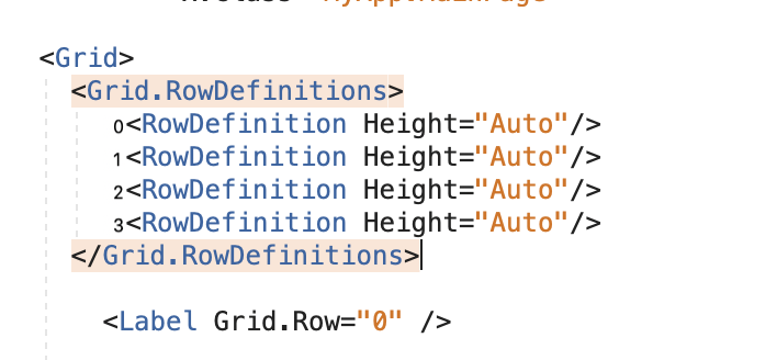
GridLocationcan lookup the index of a named row or column in XAML:Grid.Row={local:GridLocation namedRow}.
GridSpancan calculate the span between two named rows or columns in XAML:Grid.Row={local:GridSpan From=startRow, To=endRow}.
These extensions require that each row and column definition include anx:Nameattribute to expose it to the extension. For example:<RowDefinition x:Name="contentRow" Height=Auto/>.
This is an example ofGridLocationandGridSpanapplied to the previous code sample:
The desired row/column of an element is described clearly through the{local:GridLocation dividerRow}syntax.
As rows/columns are resolved at runtime via theGridLocationextension, we can freely move and delete rows/columns without needing to readjust indices and spans.
We can use theFromandToproperties onGridSpanto calculate the correct spans through names. This reduces code complexity and makes it clear what the intended behaviour of a span should be.
Each row/column definition are now documented via thex:Nameattribute.
Immediately this code is more readable; a developer can look at it and clearly understand the intended location of a view in the UI. We are more likely to spot errors while building our UIs and code-reviewers can more easily understand the intent of our UIs.
Additionally, our XAML is now resilient to refactoring. Need to remove a row? No problem! Delete it and as rows are resolved by name, there is no need to update indices and spans.
Disclaimer
While stable, tested and working, these extensions should be considered experimental. I wouldn't recommend using them in yours apps just yet for the following reasons:
The extensions execute a Xamarin.Forms internal API through reflection. Unless Xamarin.Formsexposes the relevant APIs, this methodology could break at any point in the future.Xamarin.Forms Team: Please expose this API so I can do this properly😅
These extensions do not have API documentation.
These extensions do not have thorough error logging to assist you in diagnosing runtime issues.
These extensions use reflection to perform the location and span calculations. This may have adverse runtime performance impacts.
Finally, these extensions do not have code completion or design time analysis to assist in development. (But this could be added to MFractor pretty easily😉).
Summary
To recap, while grids are a powerful layout that gives pixel perfect control, they can be difficult to maintain. By replacing the use of 0-based indices with names, our code become more readable and more resilient to refactoring.
The full source code for the GridLocation and GridSpan extensions, as well as a working example of them,can be found here.
]]>
https://www.mfractor.com/blogs/news/net-5-0-and-c-9-0-for-xamarin-developers2020-12-03T16:24:20+11:002020-12-04T12:37:34+11:00.NET 5.0 and C# 9.0 for Xamarin DevelopersRafael VeroneziMore]]>
.NET 5.0 and C# 9.0 for Xamarin Developers
.NET 5 has finally arrived and is one of the biggest releases on the history of .NET platform!
As the first phase on the unified view that Microsoft unveiled last year, we finally have a single platform for our entire application stack.
But what does this means for Xamarin developers?
Last may Microsoft announced.NET Multi-platform App UI(or MAUI for short); the future of Xamarin and Xamarin.Forms that makes Xamarin a first-class member of .NET. But, as this is such a big a change that it would not be able to be ready in time for .NET 5.0, so its postponed to version 6.0, expected to be released next year.
While we wait for MAUI and .NET 6.0, we haveXamarin.Forms 5.0to look forward to in the immediate future. Including brushes/shapes support, swipe view, drag+drop, templating and much more!
The .NET team is also focusing its unification effort by bringing most of the .NET Core BCL implementation to Mono. This is exciting as we can take advantage of theoptimizations in .NET 5in the most recent versions of Xamarin.Android and Xamarin.iOS. This source code unification should be ready by .NET 6, when they will be named.NET for iOSand.NET for Android(and the Xamarin brand will be dropped😬).
Well, for now I've talked about the invisible part, but there's an important last piece that we can start using right now:C# 9.0!🎉
C# 9.0
The latest installment of the language is not automatically enabled for Xamarin projects, butJames Montemagnohas done agreat post explaining how to enable itwhile explaining the rationals behind language selection and availability.
But what's good about C# 9.0? Well, there are lots of new features, some postponed from previous versions and finally made available. One of these new features isRecord Types. This is a language construct that allows us to declare data objects that can easily be made immutable, like:
The example above declares aFeedEntryclass that represent a blog post on a site feed. Notice the use of theinitin place ofset. This ensures that the property can only be set once on object creation. Records declaration also have a simplified syntax:
publicrecordEntryAuthor(stringName, stringEmail);
This will declare anEntryAuthorrecord with the propertiesNameandEmail. Then when creating new instances we can using theTarget-typed new expressions:
EntryAuthorauthor=new("Rafael Veronezi", "rafael@mfractor.com");
FeedEntryentry=new()
{
Title=".NET 5.0 and C# 9.0 for Xamarin Developers",
Author=author,
Published=DateTimeOffset.Now,
Content="<This blog post content 😎>"
};
Some developers prefers to have type annotation before the variable itself but like the conciseness of thevardeclarations. This new syntax allows for both and can also be used to initialize class fields and properties:
Last, but not least, suppose we need to set the published date on the instance we have created? Immutability is a concept from Functional Programming where we never mutate values on a object, but create copies with new values and we're covered here:
FeedEntryentryWithSummary=entrywith { Summary="Get to know .NET 5.0 and C# 9.0 from Xamarin Developers PoV" };
Our initial record hadn't declared theSummaryproperty. By using thewithexpression on the previous record we could create a new instance with all the existing values and adding the summary.
Summary
Well, that's a crash course on some of the features that I found most interesting and that I'll probably be using day-by-day, but there's lot more likepattern-matching enhancementsandTop Level Statementsthat you can check on the docs.
For now I hope I could give you some insight about what we already have available to us mobile developers. There are still some time until we get to MAUI and all the niceties to come with .NET 6, and we will keep exploring it on the months to come to make sure we provide the best tooling for developers to the nice new features and patterns we have head.
Stay tuned!🙂
About the Author
Rafael is a brazilian Software Engineer who have worked across several development stacks and settles its passion on the Mobile Development, as a an Architectect on native iOS and Xamarin projects, and works as a developer of the MFractor. During the last decade he taught several courses on mobile development on his home country and is passionate about learning and teaching technology.
]]>
https://www.mfractor.com/blogs/news/introducing-the-app-icon-importer2020-11-17T07:38:23+11:002020-11-17T07:40:09+11:00Introducing The App Icon ImporterMatthew RobbinsMFractor 4.4 adds support for Visual Studio Mac 8.8, fixes some bugs in IntelliSense and adds our latest and greatest feature, the App Icon Importer wizard.
Today I'm happy to announce the release of MFractor 4.4! 🥳
MFractor 4.4 adds support for Visual Studio Mac 8.8, fixes some bugs in IntelliSense and adds our latest and greatest feature, the App Icon Importer wizard.
Introducing The App Icon Importer
Ever needed to update the launcher image for your Android and iOS apps? You either need to create and add each image size one-by-one or use an online app icon creation tool and then manually add it into your project. It's one of the trickier parts
In MFractor 4.4 we are introducing the App Icon Importer to make updating your apps icon dead simple; point the importer at a source image (1024x1024 or higher) and MFractor will generate all app icon sizes for your Android and iOS projects. For Android projects, MFractor will also update your manifest to point to the new icon.
The app icon importer can also generate adaptive icons for Android. Select the Create Adaptive Icon checkbox when importing into an Android project and MFractor will create the icon and icon_round XML files (if required), generate the foreground images in the correct sizes and update the Android manifest.
To use the app icon importer, right click on your project or solution, choose Add and then App Icon. Or, the importer can also be access through the top MFracto menu, then Import and then App Icon.
To learn more about the app icon importer, please see our documentation:
MFractor 4.4 also supports the latest Visual Studio for Mac (8.8) and fixes several bugs caused by API changes in the newest version of Visual Studio.
]]>
https://www.mfractor.com/blogs/news/using-visual-studio-mac-5-handy-hidden-tools2020-08-19T09:51:00+10:002020-08-19T10:03:59+10:00Using Visual Studio Mac: 5 Handy Hidden ToolsMatthew RobbinsLearn about five handy features in Visual Studio for Mac.
Visual Studio for Mac is my one true love when it comes to IDEs. I use others now and then, and there's some great stuff out there, but VS Mac is where I feel at home. Even though I've been using VS Mac for years, every now and then I discover an awesome feature hiding behind a hotkey. Today I'll show you my five favourites.
Go to Line
Command + L
Up first is Go To Line. Don't worry, I'm not talking about the much maligned statement from programming's past. This is a nifty hot key to let you jump around a file super quickly without having to reach for the mouse.
To use it, pressCommand + L, type in a number, hit enter, and you're done.
I don't always know exactly what line I need to go to but I often have a bit of an idea like "My OnDisappearing is right down the bottom, 300 will do" or "I need some usings, this is an easy one, line 1".
Go To Matching Brace
Command + Shift + \
Have you ever worked with some messy code where you've got 3 levels of nestedifs and aforeacharound it inside an inner class wrapped up in a lambda? And you just can't figure out where your brace ends after scrolling down 200 lines?
No, me neither, of course all my code is beautiful, but let's just say I did have a some files like that.
Put you caret next to an open{or close}, you'll see that the brace is highlighted in a light grey. If your file is short enough/your screen is tall enough you'll be able to see the matching closing brace is highlighted to match. Whether it's on screen or not, pressCommand + Shift + \and the caret will jump the the matching brace.
Edit Project File
Right click on project and Edit Project File
Sometimes we need to open our project files (.csproj), maybe to change some Nuget versions or tinker with some hidden configurations. You used to have to go out to the finder and dig around to open it in a text editor, and even once you found it,.csprojs were scary and editing a live file could get weird.
Project files are getting simpler and IDEs are getting smarter. XML is fun again! Right click the project and clickEdit Project Fileand you're up and running.
Global Search
Command + .
This one is my favourite, and I've only started using it to it's full potential very recently. PressCommand + .or click in the search at the top right and your in the Global Search. It may seem like just a little search box, but it's surprisingly powerful.
Global search allows you to search for files, classes, methods, IDE features, Nuget packages, or any other string in your solution.
To use it, pressCommand + .and start typing. There's a pretty good chance it will find what you're looking for and suggest it as the top result or not far below. If not the selectSearch in Solution...and it will find all result and show them in the Search Results pad.
Search Files
By typing in ".xaml" it finds myApp.xamlas the first result and then suggests other xaml files.
When looking for theInfo.plistit finds it before I can finish typing the name.
A great way to use the search is to double highlight some text in a file and pressCommand + .and it will search for the string, no need to copy and paste.
Search Commands
You can also use the global search to find IDE Commands. This is great for all the features that you know are in a menu somewhere but can't find, or if you just don't want to mouse your way through them.
A few of my favourite searchable commands are:
Reopen closed tab – start typing "reopen"
MFractor MVVM Wizard – start typing "MVVM"
Reveal in Finder – start typing "Finder"
If it's a menu item, you can probably open it by searching for the command.
Open Integrated Terminal
Control + Shift + ~
One of the newest features in VS Mac is the Integrated Terminal, and with the new feature, a new hotkey to open it up. Just hitControl + Shift + ~, or if you're more of a mouse oriented user clickView > Pads > Terminal.
It makes me happy that I no longer have to leave the IDE to run terminal commands for Git, Entity Framework scaffolding, ADB etc. Until now we haven't seen much going on in the terminal for Xamarin projects but it is used a lot in .NET Core and we can expect to seedotnetcommands available for us when MAUI is released.
Summary
The features we've looked at here help you get things done faster in Visual Studio for Mac. This not only helps by saving time but helps you stay focused by not having to dig through folders, menus, long files and opening up external tools.
About The Author
Lachlan is a freelance Xamarin developer who has recently been branching out into Blazor. As a co-organizer of theBlazor and Xamarin Meetuphe regularly presents on whatever his latest .Net adventure has been. When not writing C# you'll usually find him riding a bike or playing double bass.
]]>
https://www.mfractor.com/blogs/news/mfractor-4-3-now-available2020-08-06T15:06:23+10:002020-08-06T15:06:23+10:00MFractor 4.3 Now AvailableMatthew Robbins
Today I'm pleased to announce the release of MFractor 4.3 for Visual Studio Windows and Mac.
This release provides support for Visual Studio Mac 8.7 and includes many tooltip features for both XAML and C#. In 4.3, my goal is to surface useful additional information about your code and to improve the navigation experience in MFractor.
Let's dive into this release.
Navigation Links
MFractor has long included rich navigation support for data bindings, static and dynamic resources, localisation values and much much more.
To help you discover these navigation shortcuts, MFractor now includes "navigation links" inside its tooltips when available.
For example, if you hover over a binding expression, you can use theNavigate To Binding Context Propertylink to jump to the referenced property on the view model:
Or, hover over a static resource and use theNavigate To Static Resourcelink to jump to the static resource declaration:
To perform the navigation, click on the the link and MFractor will take you to the symbol.
Navigation link tooltips are available in both Visual Studio Windows and Mac.
Integrated Help Links
MFractor includes almost 100 XAML analysers to spot a wide variety of bugs and code issues. To make it easier to understand the error that MFractor is reporting, our analysis tooltips now include a help link to that analysers documentation:
XAML Tooltips
In addition to navigation and help links, 4.3 adds several new XAML tooltips.
Hover over a localisation lookup via a RESX design class to view a summary of the localisations for that key:
Hover over an SVG path to see a preview of that path rendered:
Lastly, for our Visual Studio Windows users, we've added font tooltips to help let you preview a font directly within the XAML editor.
Hover over a string where aFontFamilyis defined for the XAML element and MFractor will render a preview of that string:
C# Tooltips
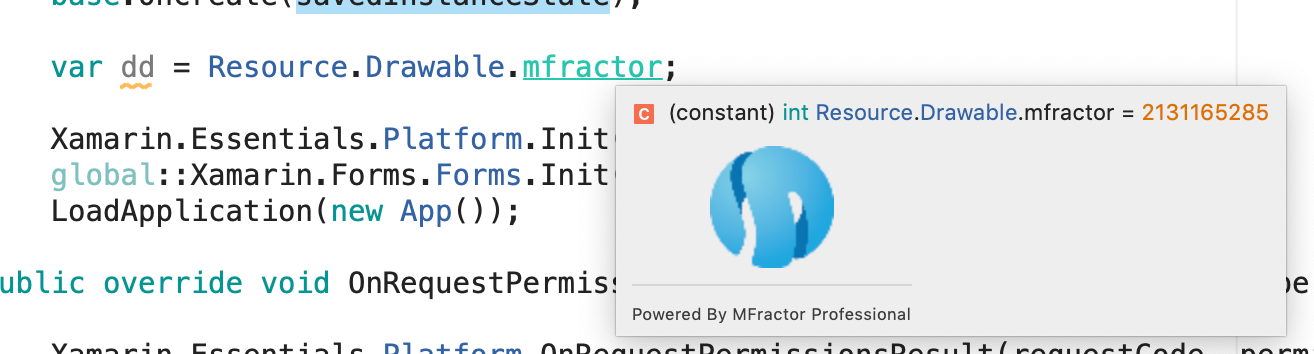
This release also adds several useful tooltips to the C# editor, helping you visualise localisations, colors, images and date formats.
Hover over a localisation lookup via a RESX design class to view a summary of the localisations for that key:
Hover over a hex value defined in a string to see a preview of that color:
Hover over an image reference in a string to see a preview of that image asset:
Lastly, hover over a string that is a valid date time format to see a preview of that format:
Summary
MFractor 4.3 makes it easier to navigate your code with navigation links and surfaces tonnes of additional information through a variety of new tooltips.
In addition to these new features, Raf and I have put a lot of work into improving the performance of the product and fixing many, many customer reported issues in MFractor for Visual Studio Windows.
]]>
https://www.mfractor.com/blogs/news/android-debug-bridge-for-xamarin-developers2020-07-21T06:30:00+10:002020-07-21T06:30:42+10:00Android Debug Bridge For Xamarin DevelopersMatthew RobbinsADB, Android Debug Bridge, is a useful command line tool that Xamarin developers can use to interact with Android devices for debugging and diagnostics.
ADB, Android Debug Bridge, is a useful command line utility for interacting with Android devices for debugging and diagnostic purposes. Xamarin developers can use ADB to install/uninstall packages, inspect running apps, push and pull files and check error logs.
One of the main reasons to use ADB is to work out what's happening on your devices when things aren't going right. As .Net developers we're pretty lucky to have a fully featured debugger to help us solve a lot of problems but some issues appear outside of the debug cycle.
Accessing and using ADB on the command line
This article assumes you have Visual Studio 2019 for Mac or Visual Studio 2019 for Windows installed with theMobile development with .NETworkload. We'll access ADB from the SDK command prompt lunched from Visual Studio. If you want to run ADB on Linux, without Visual Studio or using the built in terminal additional configuration may be required but we won't cover that here. ADB can be downloaded as part of theAndroid SKD Platform Tools.
Once a terminal is open, typeadband hit enter. You should see a long list of instructions and commands. If you see a message saying'adb' is not recognized...or similar you will need to look into configuring your path or installingadb.
Overview of most useful commands
ADB is a very powerful tool, with a lot of commands, so we'll focus on the most useful commands that you'll want to use when developing Xamarin Android apps.
Devices
The first command you'll want to use isDevices. It displays a list of all Android devices that are currently connected.
Install
To install an APK from your computer onto a device you can use theInstallcommand. This is really useful for testing archives before publishing and releases built on continuous integration services.
To install a package you will need to pass it the file path of the APK.
Removing an application using the Uninstall command removes the app from the device and all of the applications preferences and files. Removing an application using the Android UI can leave traces behind which can cause problems when installing. The adb uninstall command performs a thorough uninstall.
Theadb shellcommand lets you interact with your device as you would any other computer including file browsing and executing commands. Android is essentially a Linux distribution so most of commands from a mac/Unix/Linux terminal can be used in the same way. Using shell, you can access several utilities built into Android to capture screen shots, change settings, monitor activities inspect permissions and more.
For exampleadb shell lswill give you a list of files and folders.
Activity Manager
The Android Activity Manager is used to start/stop and pass data between activities using intents. It is accessed using the shell command e.g.adb shell amrather than being called directly as part of ADB.
Push/Pull
To transfer files to and from a device we useadb pushandadb pull. These both require two parameters – the source and the destination.
e.g.adb pull /sdcard/data.sql
Inspecting Devices
The first step to inspecting devices will be to use theadb devicescommand as mentioned above.
Runningadb deviceswill give you a list of serial numbers. If you don't see any devices listed make sure your device is connected and has USB debugging enabled.
In the list we see three entries but we can't tell much about them. We can see their serial numbers, which hint that one is an emulator, but doesn't give anything else away.
By adding the -l (lower case L for list) we get a bit more info.
Now we can work out which serial matches my Pixel 3a and which matches my Samsung T510.
For most ADB commands you will only want to target one device. When multiple devices are connected this means passing the device serial in each command. To keep things simple I typically disconnect all but one device to avoid confusion and to prevent re-entering the serial every time.
Once we've got our device showing in adb we can view the output log of a running device usingLogcat.
Logcat outputs the logs from a device to gain insight into what's happening in real time. This is particularly useful for debugging issues that only appear in release/production builds of your Android app.
The default use of the commandadb logcatwill display everything in the terminal, updating live. This will fly past so quickly that it will be hard to make any sense of it, but it is interesting to see just how active the android system is even when you're not actively using an app.
e.g.adb logcat
The output of logcat is much easier to digest if you store it in a file. The quickest way to do this is to add>and a file name. Once logcat has run you can then open in your text editor of choice to search at scroll at your leisure.
While logcat is running you may want to try launching your app, or performing what ever action you're trying to debug. When you're ready press ctrl+c to stop logging and you can open the file.
E.g.adb logcat > myFile.log
The output of logcat can also be accessed in Visual Studio by opening the Device Log Pad. This makes it easy to choose which device you want to watch from a drop down menu and offers filtering options. The device logs tab also shows iOS device logs which aren't access via ADB and would otherwise require you to use Xcode.
Managing Applications
Applications installed on an Android can usually be managed from the Android UI, with your apps deployed for debugging using the IDE. There are a few advanced situations where using ADB can give you more options or get you out of a tight spot.
Installing
The main reason I tend to use adb install is if I have a release build that I want to test before uploading to the Google Play Store. It's such a pain when you get rejected from the store because the app crashes on launch and they don't accept "the debug build works on my phone" as an excuse.
e.g.adb install /my/package.apk
Uninstall
If you're having problems with Visual Studio installing a new build to your device, even if you've deleted it, the uninstall command is the easiest way to make sure the app in completely gone.
e.g.adb uninstall com.mycompany.mypackagename
List of installed packages
If you want a list all packages installed on your device, thepm(package manager) command, run using shell is the way to go.
There are various flags you can pass to pm to get it to behave differently but the easiest way to get a useful out put is to runadb shell 'pm list packages -f'. If you want to read a little more about other uses, there's a usefulgist by David Nunezwith lots of good comments on it.
Run-as
Once you have anadb shellsession open, your likely to want to look at the files in your app's sandbox but if you search around they're nowhere to be seen. This is because every android app runs as it's own user to protect the user's content from malicious code in other apps.run-ashelps us out here by allowing you toruncommandsasif you were the app. This is similar to typingsudowhich at a terminal makes you run-as the administrator.
I use Xamarin.Essentials.Preferences in a lot of my apps to store some basic user settings. On Android this is implemented using a shared_prefs file. Let's crack my app open and take a look. We'll start by starting an adb shell session.
This give me a command prompt on my android. Now I'll runrun-aswith my package name.
My prompt now includes the package name to show that we are running as the app. As a quick test, runninglswill show you the folders the app uses.
I can now use cat to print out the contents of my shared_prefs.
As you can see, this app only has one preference in it and the user has decided to turn off analytics.
For security's sake, this can only be done on debug builds, although you can get around this with rooted devices so shared_prefs is not an appropriate place to store sensitive data.
Copying files to and from a device
One of the useful features of ADB is the ability to transfer files using the pull and push commands. While there are various other ways to access these files, ADB makes it fast and repeatable, whereas accessing storage through finder/explorer will be slightly different depending on device manufacturer and version.
One situation where this can be useful is if you use a SQLite database in your app and you want to transfer the database file to you desktop to inspect the contents.
Pull is used to transfer a file from your device to the computer.
e.g.adb pull sdcard/data.csv data.csv
Push
Similarly push is used to get transfer a file from your computer to your device.
e.g.adb push data.csv sdcard/data.csv
Summary
ADB let's you take control of you Android device and see what's going on inside. As its name suggests, it's a really useful tool for debugging your apps, especially in the edge cases outside of normal business logic debugging and when approaching a release.
Lachlan is a freelance Xamarin developer who has recently been branching out into Blazor. As a co-organizer of theBlazor and Xamarin Meetuphe regularly presents on whatever his latest .Net adventure has been. When not writing C# you'll usually find him riding a bike our playing double bass.
]]>
https://www.mfractor.com/blogs/news/simplifying-grids-in-xamarin-forms2020-07-02T06:36:29+10:002020-07-02T06:39:43+10:00Simplifying Grids In Xamarin.FormsMatthew RobbinsMore]]>
In Xamarin.Forms, theGridis a powerful layout container where we can use rows and columns to place controls.
Historically, we would declare our rows and columns using theGrid.RowDefinitionsorGrid.ColumnDefinitionsproperties. To create a row or column, we would define a newRowDefinitionorColumnDefinitionelement and specify its size:
Introduced in Xamarin.Forms v4.7, developers can declare grid row and columns using a comma-separated list of values. Thesimplified formatfor declaring and makes declaring .
With this new simplified format, our previous example becomes:
Using the new format, we removed a significant amount of XAML and made our row and column definitions terser. Adding a new row or column becomes as simple as adding another comma separated value, making makes our code easier to understand and easier to maintain.
Beautiful stuff!😍
Migrating To Simplified Rows/Columns
To help you convert your grids to the new format, we introduced theConvert to attribute formatrefactoring intoMFractor Professional.
This refactoring converts your existing row and column definitions into the new simplified format:
As grid row/column shorthand format was introduced in Xamarin.Forms 4.7, the Convert To Attribute Format refactoring will not appear in lower versions of Xamarin.Forms
]]>
https://www.mfractor.com/blogs/news/introduction-to-dialogs-in-xamarin-forms2020-06-23T06:35:00+10:002020-06-23T07:55:45+10:00Introduction To Dialogs In Xamarin.FormsMatthew RobbinsA getting-started guide for dialogs in Xamarin.Forms that introduces the core concepts and terminology.
When developing mobile applications, dialogs are a foundational building block in our tool-belt. We can use dialogs to show a confirmation message, to indicate when the app is working or even display a rich input form that appears over our main user interface.
As this article is intended for absolute beginners, we'll introduce the core concepts and terminology for using dialogs, get you started with the most current dialog frameworks and provide a quick reference on the main dialog types.
If you're totally new Xamarin.Forms and want to learn about dialogs, this is the article for you.😉
Let's take a moment to introduce two important terms used throughout this article:
Modal: A modal dialog appears over the existing user interface and blocks input to the elements beneath it, not allowing users to exit by tapping outside it. Modal dialogs effectivelyfocusthe users attention onto the dialog.
Transient: A transient, or temporary, dialog that dismisses by itself without user intervention. For example, dialogs that automatically dismiss after a specified time span are considered transient.
These terms, Modal and Transient, will be used many times in this article.
Next, let's explore the seven main dialogs kinds that we will explore in this guide:
AnAlertis a modal dialog used to show a message to a user.
Alerts are a convenient way to inform the user that something has happened or that they need to make an action. They're useful when you need confirmation from the user that they have read the message.
Using Acr.UserDialogs, we would show an alert like so:
Acr.UserDialogs.UserDialogs.Instance.Alert("Welcome to alert dialogs", "Ok");
To keep concise, from now on I'll keep that Instance in field calleduserDialogs. So for the rest of the examples we can just calluserDialogs.Alert("Welcome to alert dialogs", "Ok");.
Confirm
A special kind of alert dialog is aConfirmdialog, an alert that display a message with a choice of two actions.
Presenting a Confirm Dialog is quite similar to an alert but instead you callConfirmAsyncand pass in another string argument for the extra button. It returns aTask<bool>to let you check the user's selection.
var result = await userDialogs.ConfirmAsync("Would you like to confirm selection?", "Confirm Selection", "Yes", "No");
Confirm dialogs are used ask a user to make sure something is correct before the action occurs, or to choose between two options.
Prompts
APromptis a modal dialog that asks the user for some basic text input, such as asking for a name or email address.
Using a prompt
Displaying a prompt is quite similar to how we display Alerts and Confirm dialogs. The key difference being in the PromptResult that it returns, where you'll find aboolOkto indicate if the user confirmed input andTextwhich contains the text they entered.
var input = await userDialogs.PromptAsync("What is your email?", "Confirm Email", "Confirm", "Cancel");
if (input.Ok)
{
   Console.WriteLine("Your email is" + input.Text);
}
Action Sheets
AnAction Sheetis a modal dialog that presents the user with a selection of choices and, optionally, a cancel and destructive action.
These are typically used when there are multiple actions a user might want to take. An example would be in an email application if a user clicks on an email they may want to Open, Forward, Reply, etc.
In this case the destructive action would beDelete, which would be displayed in red and separated from the rest of the list, hinting to the user that this action is serious and that they should think carefully. TheCanceloption is also displayed differently to make it obvious that it is separate to the other choices.
To display an ActionSheet, we'll need a list of choices and then we calluserDialogs.ActionSheetAsync().
var choices = new [] { "Oranges", "Apples", "Bananas" };
var choice = await userDialogs.ActionSheetAsync("Choose A Fruit", "Cancel", "Destroy", CancellationToken.None, choices);
if (!string.IsNullOrEmpty(choice))
{
   Message = "You chose " + choice;
}
else
{
   Message = "Action sheet was cancelled";
}
If you don't want a Cancel button or Destructive action you can passnullinstead of a string for these parameters.
Toasts
AToastis a small, transient popup that shows at the bottom of the screen, useful for display displaying small and unobtrusive messages.
A good example of using a toast is to notify the user that their data has been saved successfully.
Displaying a Toast is once again done using userDialogs, but this time calling the Toast method. As there is no title or dismiss button we only need one string input for the text to display.
userDialogs.Toast("I am a toast. Great for showing small pieces of transient information.");
Progress Indicator
AProgressindicator is similar to the built in activity indicator, the key difference being that it keeps the user updated on the progress throughout the task instead of simply indicating that something is happening.
Here I'm updating progress using a loop with a delay of 20ms, in a real app you would update this based on how much work had been done and what was remaining.
using (var progress = userDialogs.Progress("Loading..."))
{
   for (var i = 0; i < 100; i++)
   {
         progress.PercentComplete = i;
         await Task.Delay(20);
   }
}
Custom Popup
All the dialogs we've looked at so far have a fixed layout and serve a specific purpose. With a customPopupyou can put any content you want inside with any appearance. These are useful if you want more advanced interaction or if you want it styled to match your app instead of the system UI.
Custom popup take a bit more work than the others, for this example we'll show a popup with an image and two buttons. To accomplish this, we will use the Rg.Plugin.Popups NuGet package.
The first step is to create a new XAML ContentView called CustomPopup, this will give you aCustomPopup.xamland aCustomPopup.xaml.cs. Instead of using ContentView as the base class, we'll swap the element to be apopups:PopupPagewhich will allow us to use it as a popup.
Inside the PopupPage we can put any Xamarin.Forms content we like. Here I've got aGridthat contains anImageand twoButtons.
In the code behind we'll need a constructor that takes in anAction, and methods forConfirmandCancel.
public partial class CustomPopup : PopupPage
{
   private readonly Action<bool> setResultAction;
   public void CancelAttendanceClicked(object sender, EventArgs e)
   {
      setResultAction?.Invoke(false);
      this.Navigation.PopPopupAsync().ConfigureAwait(false);
   }
   public void ConfirmAttendanceClicked(object sender, EventArgs e)
   {
      setResultAction?.Invoke(true);
      this.Navigation.PopPopupAsync().ConfigureAwait(false);
   }
   public CustomPopup(Action<bool> setResultAction)
   {
      InitializeComponent();
      this.setResultAction = setResultAction;
   }
}
With these methods we can create a our custom popup and display it with the true/false result being passed to a callback. This code is a little messy and if we're using this code in multiple places in the app it's a bit of a pain. instead we can add a static method to CustomPopup which makes it much neater to call from other classes.
public static async Task<bool> ConfirmConferenceAttendance(INavigation navigation)
{
   TaskCompletionSource<bool> completionSource = new TaskCompletionSource<bool>();
   void callback(bool didConfirm)
   {
         completionSource.TrySetResult(didConfirm);
   }
   var popup = new CustomPopup(callback);
   await navigation.PushPopupAsync(popup);
   return await completionSource.Task;
}
This wraps up the callback in an awaitableTask<bool>so you don't have to worry about actions. Now when we want to display theCustomPopup, it feels a lot more like how we displayed the other dialogs.
var result = await CustomPopup.ConfirmConferenceAttendance(navigation);
Summary
All of these dialogs are similar but have slight variations based on what you need to present and what input you need from the user.
As a quick guide for deciding which to pick, consider which situation best describes your needs:
I want to display some text and have the user acknowledge the message:
These libraries are both free and Open Source but they rely on the support of their users. If you find UserDialogs to be useful in your project, please sponsor Allan Ritchie through hisgithub sponsor page.
Lachlan is a freelance Xamarin developer who has recently been branching out into Blazor. As a co-organizer of theBlazor and Xamarin Meetuphe regularly presents on whatever his latest .Net adventure has been. When not writing C# you'll usually find him riding a bike our playing double bass.
]]>
https://www.mfractor.com/blogs/news/cleanup-your-xamarin-forms-mvvm-bindings-using-value-converters2020-06-09T08:27:00+10:002020-06-09T08:27:40+10:00Cleanup Your Xamarin.Forms MVVM Bindings Using Value ConvertersMatthew RobbinsMore]]>
When working with Data Binding in Xamarin.Forms you can often end up with a property in your ViewModel that's of the wrong type or needs to be converted.
Maybe you've gotdoublefor a total and you want a field to change colour if it's negative, or anenumthat should be displayed as a user friendly string.
Another classic example is when you have a boolean propertyIsBusythat you bind your ActivityIndicator too but you want another element to only appear when not busy. An obvious approach to take, is to use another property calledIsNotBusybut then you've got the data in two spots that you need to worry about updating and making sure youNotifyPropertyChangedfor both. This is also not very reusable if you want to bind to the inverse value of a boolean multiple places in your app.
A Value converter sits in between your View and ViewModel and converts the data into the format you need by running a method each time the property is set or accessed.
Let's do it
Using a value converter typically involves three steps
Writing a value converter
Declaring it as a static resource
Consuming it in your views.
Let's say we're working on a weather app and we want to decide if it's warm enough to wear shorts.
The ViewModel has a property:
public double Temperature {get;set;}
In our View we'll have a label that should only be visible if it's warm.
<Label Text="You should wear pants" IsVisible={Binding Temperature} />
Binding aboolproperty in the view to a double in the ViewModel isn't going to work without a converter. So let's write one.
Step 1 - The Converter.
We start by making a class for our value converter and have it implementIValueConverter. You'll end up with a skeleton class that looks like this:
public class DoubleToBoolConverter : IValueConverter
{
    public object Convert(object value, Type targetType, object parameter, CultureInfo culture)
    {
    ...
    }
    public object ConvertBack(object value, Type targetType, object parameter, CultureInfo culture)
    {
    ...
    }
}
We've got one method that converts a value and another that converts it back. In our case we'll want to return aboolbased on the inputdoublevalue which all happens in the Convert() method. Unfortunately this method isn't type safe so we'll have to do a couple of type checks, and then assuming it is adouble, return the appropriate value.
public object Convert(object value, Type targetType, object parameter, CultureInfo culture)
{
    //Check if the value is a bool,
    if (value is double == false)
    {
        //This only happens if we try to use this converter
        //on a property in our view model of a different type.
        return default(Color);
    }
    var input = (double)value;
    //We can now safely perform calculations with our `input`
    return input > 25;
}
Step 2 – Static Resource.
The next step is to add the converter as aStaticResourceso that our xaml properties know where to find it. Just like anyStaticResourceyou have the choice of adding it to your App.xaml if you plan to use this resource on multiple pages or in the page's resource dictionary if you don't plan to use it elsewhere. Let's just add it to one page for now.
The final step is to update our Binding in the view to use the converter from our StaticResource.
<Label Text="You should wear pants" IsVisible={Binding Temperature, Converter={StaticResource doubleToBoolConverter}} />
Right now I'm guessing you're thinking something along the lines of "But that's so much boilerplate and syntax to remember! Do I have to write that every time". Thankfully, the answer is no.
The MFractor Value Converter Wizard
MFractor can set up your class, look after your type checking and wire up the resources so you only need to write the logic of the converter and then get back to the fun stuff.
Click the MFractor Menu, then Wizards, ValueConverterWizard
In the name box we enter in a name for the converterDoubleToBoolConverter
Infer Input/Output typesis checked by default so from the name it has worked out our types. In the preview we can see it uses these types to check the input and set up a default output. It also sets up[ValueConverterAttribute]which helps analyzers check usage of the converter and the types.
In theAdd XAML Entry To:drop down MainPage.xaml is selected by default because I had the page open. You can also select App.xaml if you want your resource available to all pages.
ClickGenerate Value Converterand we're done. The value converter is mostly written for your, the StaticResource is set up and the converters namespace is even added to your page.
Generate Value Converter from Code Action
The wizard is great but if you're working away on a xaml file and you suddenly discover you need a converter, you can also generate a converter from the right click menu. You'll find it in theMFractor Code Actions menualongside any other relevant actions. Clicking the action will open up the wizard with all values filled out already with a name based on the types detected in the binding.
Accessing the wizard from your xaml not only lets MFractor know the details of your converter so it can fill out the fields for you, it also means the new converter is applied to your binding automatically.
Benefits for MVVM
ValueConverters don't require you to follow an MVVM pattern but they do work really nicely together and help to keep your view models clean and easier to read.
Some of the benefits for your view models include:
No colors in your view models. Their presence here is up for debate but if you want to cut down on how muchVis in yourVMthese can be some of the hardest parts to separate out without ValueConverters
Remove getters for derived fields
Remove complex getters setters where values are linked e.g. IsBusy/IsNotBusy
Reduce calls to OnPropertyChanged() by allowing you to bind multiple view properties to one view model property.
Parameters
Sometimes a value converter needs input from the view to provide context, this is where theValueConverterParametercomes in handy.
In our weather example from before the ValueConverter always uses 30 as the threshold to decide between true and false. It would be a whole lot more useful and reusable if this value could be provided by the View.
To extend our weather app, we add a label that lets the user know they should bring an umbrella. We can reuse our converter because once again we want to convert a double to a bool.
<Label Text="Bring an umbrella" IsVisible="{ChanceOfRain, Converter={StaticResource doubleToBoolConverter}}">
A little bit of rain doesn't scare me but lugging an umbrella around does, I only want to bring an umbrella if the chance of rain is more than 80%. So we add aConverterParameterof 80.
<Label Text="You should bring an umbrella" IsVisible="{Binding ChanceOfRain, Converter={StaticResource doubleToBoolConverter}, ConverterParameter=80}" />
We've written theConvertmethod but so far theConvertBackmethod is empty. Quite often a converter only makes sense in a one-way-binding so theConvertBackmethod is unnecessary.
Let's add another feature to the app. We'll ask the user if it's windy.
OurConvertBackmethod is very similar toConvertbut it does the opposite.
public object ConvertBack(object value, Type targetType, object parameter, CultureInfo culture)
{
    if (value is bool == false)
    {
        return default(double);
    }
    var input = (bool)value;
    if (double.TryParse((string)parameter, out double threshold))
    {
        return input ? threshold + 5 : threshold - 5;
    }
    return input ? 25 : 15;
}
All we can work out from a bool is if it's greater than or less than the threshold so here we just use a magic number and set it to be +/- 5.
The xaml for ourSwitchis very similar to the label but we use the same Converter onIsToggledinstead ofIsChecked.
Now whenever the switch is toggled it will call theConvertBackmethod and set the temperature to 15 or 25. When we check the weather again and a new temperature is set the switch will also update with the Temperature going through the Convert method to get a bool forIsToggled.
This time our ViewModel property will need a backing field andOnPropertyChangedin our setter, so that when it's set by the switch toggle, our other bindings will update.
double windSpeed;
public double WindSpeed
{
    get => windSpeed;
    set
    {
        temperature = value;
        OnPropertyChanged(nameof(WindSpeed));
    }
}
Summary
Value converters are one of those neat features in Xamarin.Forms where once you start using them, you won't know how you lived without them. Having your type conversion logic in one reusable place lets you focus on the code that matters without as much noise. Their main drawback is that there is a fair bit of boilerplate to get started but MFractor does all the heavy lifting for you with just a little prompting.
Lachlan is a freelance Xamarin developer who has recently been branching out into Blazor. As a co-organizer of theBlazor and Xamarin Meetuphe regularly presents on whatever his latest .Net adventure has been. When not writing C# you'll usually find him riding a bike our playing double bass.
]]>
https://www.mfractor.com/blogs/news/mfractor-4-2-release-maui-roadmap-and-support-for-latest-visual-studios2020-05-27T09:04:00+10:002020-05-27T09:04:50+10:00MFractor 4.2 Release: MAUI Roadmap And Support For Latest Visual StudiosMatthew Robbins
Overview
It's been a huge week of announcements at Build with news of C# 9, MAUI, new Visual Studio releases and so much more. It's enough to make one drool!🤤
MAUI Roadmap
Last week at Build,Microsoft announced MAUI, Multi-platform App UI, an evolution of Xamarin.Forms. Over the past 5 years, we've watched Xamarin.Forms become a powerful app framework and it's gosh-darn incredible news that it will now become part of .NET itself through MAUI.
MFractor will support MAUI through each of its preview phases and we will be actively seeking feedback and feature ideas to support the community throughout the transition.
The nameMFractorwas originally conceived by combining Mono + Refactor so it's great to see it can now be MAUI + Refactor.😉
MFractor 4.2 Release Overview
Here is a quick rundown of what's included in the 4.2 release.
Support For Latest Visual Studios
I'm pleased to announce that the release of MFractor 4.2 to support Visual Studio Windows 16.6 and Visual Studio Mac 8.6. These releases officially target the latest stable version for each IDE, having been compiled and tested against them specifically.
Serial Key Based Licensing
MFractor Professional can now be activated through a serial key!🥳
For the past few years, MFractor Professional has been activated via a license file attached to an email. This system worked well however it had some issues; for example firewalls sometimes blocked our license emails, it was easy to lose the license file and it wasn't intuitive/easy to activate your installation using a file.
With the new system, it's simply a matter of copying/pasting the serial key into MFractor to activate it. Dead simple!
If you have already purchased MFractor, you are unaffected by the transition to serial keys. Your MFractor installation is already activated and requires no changes. When you renew, you will receive a serial key in your next update purchase.
Please note that you will need to run MFractor 4.2 or higher to activate using a serial key.
Built-In License Recovery
If you've lost your license file and want to get it back, MFractor now includes a Recover License menu item. Enter the email address that you used to purchase MFractor and you'll receive your license via a recovery email.
Integrated Code Actions in Visual Studio Mac
MFractor includes over 100 XAML code actions that, until now, have been tucked away inside theMFractor Code Actionsmenu in Visual Studio
The 4.2 release exposes our code actions through the Light Bulb and Screwdriver menus accessible in the side bar of the text editor. You can also access our code actions by pressingAlt+Returnin a XAML document.
Memory And Performance Improvements
Over the past two weeks I've been frequently talking with our customers and diagnosing performance issues in MFractor.
I've identified and fixed several potential memory leaks and performance issues to help make your IDE smoother.
My good friends atMelbourne App Developmentare successfully using Blazor in several large-scale production systems and are sharing their learnings in two special live-stream events. Covering both the technical and business aspects of their success, these livestreams will be super interesting to understand how Blazor could be applied back into our own jobs/businesses.
If you'd like to join and learn more about Blazor in the wild, RSVP to one of the following events:
]]>
https://www.mfractor.com/blogs/news/mfractor-4-1-now-available-for-visual-studio-windows-mac2020-05-11T15:33:00+10:002020-05-11T15:37:32+10:00MFractor 4.1 Now Available for Visual Studio Windows+MacMatthew Robbins
MFractor 4.1 is now available for Visual Studio Windows and Mac.
Including automatic 30-day trials, adornments and font tooling, this release is packed to the brim with useful developer tools for Xamarin.
I'm excited to announce the release of MFractor 4.1🥳
This release is a significant upgrade to MFractor that includes automatic trials, adornments to make it easier to understand your XAML at a glance, enhancements to font tooling support and much more.
Let's dive into this release.
Automatic 30 Day Trials
When you install MFractor you will now be automatically issued a 30-day trial of MFractor Professional. Previously trials were issued on a by-request basis which, unfortunately, meant that many people evaluating MFractor did not get the best product experience.
These 30-day trials allow you to explore MFractors advanced features and really get a good idea of what the product has to offer. With automatic trials, you now have unlimited use of Image Manager, MVVM navigation tools, code generation wizards, font importer and more for 30 whole days!
MFractor Professional 30-day trials are restricted to one per machine OR email address. Once your trial expires, please purchase a license athttps://www.mfractor.com/buy.
Adornments
MFractor now annotates your XAML file with 3 kinds of adornments to reveal extra, contextual information that assist when editing XAML.
Grid adornments display the index of a row or column next to the definition.
Color adornments show a small preview of an inline color value. This also works for static resource expressions that reference a color.
Escaped XAML character adornments show the literal character represented by an escaped XAML character sequence.
Enhanced Font Tooling
Over the past few months, Microsoft has significantly improved the font experience with the addition of Embedded Font Assets; I've worked to keep pace and ensure that MFractor supports this methodology.
In addition to embedded font support, MFractor now includes IntelliSense, tooltips and analysis for font glyphs:
MFractor can now also display a preview for a font asset:
Lastly, MFractor for Visual Studio Mac now includes a font viewer pad that you can use to visually explore the contents of a font asset:
Additional Features/Enhancements
In addition to the adornments, font tooling and 30-day trials, MFractor now also includes:
New insert/delete grid row and column refactorings.
Detection of C# style newlines used in XAML with a code warning and fix.
Image manager support for UWP projects.
Code analysers to detect duplicate color and thickness values across the solution with a code fix to consolidate them.
Fixes to the binding analysis engine to support x:DataType and usage ofx:Referenceagainst the root XAML element.
For a full overview of what is included in 4.1, please see the 4.0 iterative release notes:
MFractor 4.1 is a significant upgrade to the product and makes the Xamarin.Forms development experience much smoother.
Since the release of MFractor for Windows two months ago, it's been incredible to receiving feedback from users and using it to improve the product. Thanks to all my customers and users, let's keep pushing the Xamarin tooling forward together!
😀🤙Matthew Robbins
]]>
https://www.mfractor.com/blogs/news/migrating-listview-to-collectionview-in-xamarin-forms-interactivity2020-04-30T06:45:00+10:002020-07-18T11:55:36+10:00Migrating ListView To CollectionView in Xamarin.Forms - InteractivityMatthew RobbinsLearn about interactivity in CollectionView and how to convert your ListView's to the new CollectionView interactivity APIs.
In part three of our Migrating ListView to CollectionView series, we will look at handling user interaction in CollectionView's by adding cell tap, swipe context actions, and pull to refresh.
Tapping Cells
Tapping cells onListViewwe used theItemTappedevent which I will omit for brevity because I assume everyone already knows how to use it. BecauseCollectionViewhas more features thanListView, it's a little different to get item tap setup. I see a lot of people confused over this one because they expected anItemTappedCommand. TheCollectionViewhas more flexible cell selection features, so even though there's no tap command directly, it's still easy to setup.
To tap a cell withCollectionViewwe use single selection mode along with theSelectionChangedCommand. Then we bind theSelectedItemto a property on our view model to use in our command.
We setSelectedItem = nullto remove the cell highlight, which is common to do if you're using cell tap for master-detal navigation.
It's worth noting that at the time of this writing I noticed thatSwipeViewseems to interfere with the cell selection (or rather change it's behavior selecting a cell on tap).
By enabling pull to refresh, binding to ourItemsViewModel.IsRefreshingproperty andItemsViewModel.RefreshCommand, theListViewwill setIsRefreshing = trueand execute theRefreshCommand. It's up to us to display a refresh view driven from our view model properties. In our example we re-use theEmptyView.
Here we show the runningActivityIndicatorduring refresh, and use aLabel.Triggerto display a refresh message to the user.
CollectionView
To support pull to refresh onCollectionViewwe wrap it in aRefreshView. TheRefreshViewis more flexible in that it works on any control as long as it's scrollable, meaning you could just as easily use it with aScrollViewthat is displaying a page of data instead of a collection.
The control will setIsRefreshing = trueand execute theRefreshCommandwhen the user pulls to refresh. Like before, we re-use theEmptyViewto display a loading indicator and message. This time, however, it's contained in ourCollectionView.EmptyViewproperty which is automatically shown during refresh. We can see in ourItemsViewModel.RefreshCommandthat we set ourItems = nullwhich causes theEmptyViewto be displayed.
publicICommandRefreshCommand
{
get
{
returnnewCommand(async () =>
{
try
{
Items=null;
awaitTask.Delay(5000); // Only to demonstrate refresh views..UpdateItems();
Acr.UserDialogs.UserDialogs.Instance.Toast("Items refreshed");
}
finally
{
IsRefreshing=false;
}
});
}
}
Here we have oneMenuItemdisplaying "⭐️" and executing ourItemViewModel.ItemFavouritedcommand when tapped. To migrate this toCollectionViewwe have to embed ourItemViewin aSwipeViewcontainer:
TheSwipeViewis highly customizable. Here we implement ourListViewfeature by setting some right swipe items. When ourMode="Reveal"the items are revealed on swipe. The user has to then tap on the item to execute the boundItemViewModel.ItemFavouritedcommand. IfMode="Execute"the command is executed on swipe. Then by default the drawer closes after execution, but it can be customized to stay open. We can also supply our own layout toSwipeItemViewas we do here, which is very nice.
The combination of items, directions, execution modes, and swipe behaviors make this a powerful control. See full documentationhere
Summary
CollectionViewinteractivity is more flexible thanListView. Using the new APIs makes it easy to add context actions, pull to refresh, and single or multi-select.
About The Author
Derek is a certified Xamarin developer hailing from Montreal. For 5+ years he's had the opportunity to build enterprise and consumer-facing mobile apps with Xamarin.
]]>
https://www.mfractor.com/blogs/news/migrating-listview-to-collectionview-in-xamarin-forms-user-interface2020-04-23T05:49:00+10:002020-07-18T11:55:44+10:00Migrating ListView to CollectionView in Xamarin.Forms - User InterfaceMatthew RobbinsMore]]>
Introduction
In part two of our Migrating ListView to CollectionView series, we'll cover how to migrate yourListViewcells so you can use them in aCollectionView.
Cells
Setting your cell with aListViewuses aDataTemplatebut requires your view to be contained within aViewCellclass. It looked a bit like this:
CollectionViewsimplifies this. We no longer have to wrap our content in aViewCelland instead can set our content directly. Here we're using our ownInteractiveItemViewthat we'll see later:
WithListViewwe needed to specifyHasUnevenRows="true"andRowHeight="-1"to get dynamic cell sizes. SinceCollectionViewsupports this by default, the sizes are determined by the content of ourDataTemplateand that's it. This means that when you're displaying multiple cell types in your list, the heights are driven from theViewfrom eachDataTemplate.
Data Template Selector
DataTemplateSelectorfunctions the same as before but make sure the content of yourDataTemplateis no longer wrapped in aViewCell.
Empty View Support
To support this onListViewwe would add an empty view to the layout containing our list, then bindIsVisibleto view model properties that we have to manage ourselves. Here we useHasFilteredItemsandDoesNotHaveFilteredItems.
Migrating your user interface fromListVewtoCollectionViewis worth the minimal effort. We can easily support single or multiple cellDataTemplates with dynamic sizes, as well as empty views that automatically display by reading ourItemsSourcedata.
About The Author
Derek is a certified Xamarin developer hailing from Montreal. For 5+ years he's had the opportunity to build enterprise and consumer-facing mobile apps with Xamarin.
]]>
https://www.mfractor.com/blogs/news/migrating-listview-to-collectionview-in-xamarin-forms-benefits2020-04-02T07:30:00+11:002020-07-18T11:56:16+10:00Migrating ListView To CollectionView in Xamarin.Forms - BenefitsMatthew RobbinsMore]]>
Introduction
Lists are a fundamental and inescapable part of mobile applications. Think of your favourite email client or social media app; without a doubt they present scrolling vertical list of emails or posts.
In Xamarin.Forms, we can use theListViewto display vertical scrolling lists of items. However, Xamarin.Forms 4.3 introducedCollectionViewas its successor.CollectionViewsimplifies many aspects ofListViewand also adds new features.
In this 3-part blog series, we examine the benefits of collection views and how to migrate our existing list views to them.
In part one, we explore the benefits of collection view and what we gain by migrating away from list view.
In part two, we learn how to migrate our item user interfaces to support collection view.
In part three, we learn how to convert the interactivity of a list view to a collection view.
Benefits
Let's start by examining the core benefits of converting aListViewto aCollectionView.
At a glance,CollectionViewhas some major benefits:
Simpler API surface.
Feature richness.
Increased flexibility.
Better performance
Simpler API Surface
The first major benefit ofCollectionViewis that its API's are simpler and more intuitive thanListView.
So why is a simpler API surface important?
Firstly, a simpler API makes iteasierto write correct code the first time and thus avoid bugs.
Next, a simpler API means that we write less code. In general, the less code that we have, the less likely we are to write bugs.
Lastly, a simpler API reduces cognitive load. Property names clearly indicate what they do and we can understand at a glance what they will accomplish.
No More ViewCell
To create the user interface of a list views item, we would define our visual content inside aViewCellthat then lay within aDataTemplate.
In aCollectionView, however, we define our visual content directly within theDataTemplate.
By removing the concept ofViewCells, we do not need to remember this abstraction. This makes it simpler and more intuitive to define list items.
Automatic Virtualisation
Virtualisation, or cell recycling, refers to the practice of reusing views in the list as they scroll offscreen, rather than creating a new one for every item.
If we have 50 items available in our list, but we can only display 8 items, the list view would create 10 views. As an item scrolls off-screen, the list will reuse one of the non-visible views to present the next item as it appears on-screen.
ListViews use theCachingStrategyAPI to achieve this, however, CollectionViews automatically use virtualisation. This removes another piece of complexity that we used to need to consider.
Built In Dynamic Cell Sizes
It isverycommon to create lists with multiple cell types that have varying sizes.ListView, however, did not support varying cell heights by default.
To support cells with differing height, we would omit theRowHeightproperty and then setHasUnevenRowstotrue. If we forgot to do this, it would lead to bugs where the cells content would be clipped where it exceeded the row height or show excessive padding.
CollectionView adds several useful features for us:
Built-In Empty View
A common scenario we need to support when displaying lists of data is to accommodate when the list has no elements. Consider a search that returns no results; withListViewwe have to manage toggling between the empty view and list items ourselves. WithCollectionViewwe simply use theEmptyViewproperty to specify what will be shown.
We will cover theEmptyViewproperty in depth in the next article in this series.
CollectionView: Increased Flexibility
Lastly,CollectionViewis much more flexible for presenting collections of items:
Vertical/Horizontal Scrolling
Collection views can scroll vertically or horizontally by specifiying theIItemsLayout.Orientationproperty. This works with both grid and list layouts!
Item Snapping
When users scroll through our lists, we may want to force the list to snap to the start, center, or end of an item. This type of feature is common in apps, ie: a horizontal collection of cards that snap to center as you scroll.
Scroll To:Use theScrollTomethod to scroll an item in the collection into view.
Separators: CollectionViews do not have them by default (removing them is a common task for devs). To create separators for your collection view, include them within your data-template.
Summary
CollectionView, with its simpler API surface, rich features, and increased flexibility, provide many benefits over the traditionalListView.
About The Author
Derek is a certified Xamarin developer hailing from Montreal. For 5+ years he's had the opportunity to build enterprise and consumer-facing mobile apps with Xamarin.
]]>
https://www.mfractor.com/blogs/news/easily-add-a-class-from-the-clipboard-in-visual-studio-mac2020-03-30T08:45:00+11:002020-03-30T08:45:46+11:00Easily Add A Class From The Clipboard In Visual Studio MacMatthew RobbinsMore]]>
Generate a new class file using the contents of the clipboard in Visual Studio Mac.
Introduction
When working as developers, a common workflow is copy/pasting a class from an external source into our codebase.
This class may come from a wide range of sources such as:
Let's be honest, we all do this from time to time🙈
When we add a class to our codebase using copy/paste, we usually do something like:
Copy the code to the clipboard.
Open your project and create a new file.
Paste the class into the new file.
Ensure the file name to match the class name.
Cleanup the namespace to match the folder path.
This involves a lot of steps and a lot of manual cleanup work, making it error prone and tedious.
To simplify this, MFractor now includes theAdd Class Using Clipboardtool, allowing you to create a new project file using the clipboards content.
Add Class Using Clipboard
When a C# class is in the clipboard, theAdd Class Using Clipboardwill appear in the solution pads right click menu below theAddmenu.
Using Add Class Using Clipboard Tool
The Add Class Using Clipboard Wizard
The tool will automatically detect the file name based on the clipboards class, correct or create the namespace based on project and folder you are creating it from and then generates a new project file.
This let's us quickly and easily add a class by copy/pasting, avoiding any additional cleanup after we paste the class into a file.
To really see the benefits of this feature, let's examine two use cases:
Adding an class from IconFont2Code.
Adding a Github gist.
Adding An Icon Font Class
As a lover of icon fonts, one of my favourite sites isIconFont2Code, a tool that generates a C# class with named string constants for all glyphs in a font asset.
Say we have generated our C# font glyph class using IconFont2Code, the next step is to add the class to our code base.
We first copy the class to the clipboard and then, in Visual Studio, right click on our project and chooseAdd Class Using Clipboard.
When the tool added theFontAwesomeIconsclass, it automatically did the following:
Detected the class nameFontAwesomeIconsand set this as the project file name.
Encapsulated the class in a new namespace using our projects default namespace and folder path.
Generated theIconsfolder path.
Adding A Github Gist
Over the years I have worked on many different codebases and a common task I perform is profiling code sections when diagnosing performance issues.
// Usage
public void MyMethod()
{
  // Outputs "MyFile.cs | MyMethod took 20.45ms"
  using (Profiler.Profiler())
  {
    // Expensive code here
  }
}
It's simple and crude but very effective.
When it comes time to profile a codebase, I copy theProfilerclass to the clipboard and then add it to the codebase I am working on.
This is how I would do it using theAdd Class Using Clipboardfeature.
When the tool added theFontAwesomeIconsclass, it automatically did the following:
Detected the class nameProfilerand set this as the project file name.
Renamed the namespaceMFractor.UtilitiestoHelloMFractor.Utils, based on our projects default namespace and the provided folder path.
Generated theUtilsfolder path.
Summary
Adding a class by copy and pasting it from a source like Github, StackOverflow or another codebase is a common workflow. To make this easier, you can useAdd Class Using Clipboardincluded in MFractor to generate a new class file using the contents of the clipboard.
]]>
https://www.mfractor.com/blogs/news/working-with-grids-in-xamarin-forms-using-mfractor2020-03-24T19:13:00+11:002020-03-24T19:13:06+11:00Working with Grids in Xamarin.Forms using MFractorMatthew Robbins
An overview of working with Grids in Xamarin.Forms with MFractor.
An overview of working with Grids in Xamarin.Forms with MFractor
Introduction
Grids, simply put, are one of the most powerful controls in Xamarin.Forms.
Using Grids we can build rich and flexible UIs. For example, we can create responsive layouts that adapt to different screen sizes or place elements on top of one another to achieve layering (for example, a floating action button).
But, to quote Uncle Ben, with great power comes great responsibility🕷
What is this responsibility you ask? Well, each grid we build needs to be maintained!
Here are some examples of the maintenance issues with grids:
When we add a new row or column, we often need to adjust several other elements. A single change in a grid can mean we need retest our entire UI to make sure it still works correctly and we haven't introduced any new bugs.
We position views in a grid through a zero-based row or column index. Computers love numbers but humans love names, zero-based index locations aren't intuitive for us to use.
Over the years, I've built many features in MFractor to make working with Grids considerably easier. This article aims to distill some of my insights, help you understandwhythese tools came to be in MFractor andhowthey can make your Xamarin development a little easier.
I love grids to death but they can be an utter headache to maintain. Luckily, with some foresight and the right tools, they don't have to be!
Start With A StackLayout
Counter-intuitively, I recommend that you start with aStackLayoutwhen building a new user interface. Unless you need both rows and columns straight away, choosing a StackLayout is, in my experience, more preferable.
I advise this because StackLayouts are considerably easier to build and maintain. They automatically layout elements vertically (rows) or horizontally (columns) and do not need additional code likeGrid.Row/Grid.Columnto designate where an element should appear. Less code == less bugs.
The main concern I encounter when I recommend this is performance. Yes, Grids are technically more performant, but the difference is marginal. Frankly, from my 8 years of Xamarin development experience, performance usually stems from bad algorithm design, excessive memory usage, poor data-base queries or poor use of parallelism. Rarely has it been from using a StackLayout over a Grid.
We should be concerned with building the app first and foremost and worry about performanceif and whenwe encounter issues. Speed to market and delivering features for our customers are more important than premature optimisation.
Be pragmatic not pedantic.
StackLayouts, therefore, are initially more preferable. They let us deliver faster and give us greater flexibility to iterate on our user interfaces.
However, there does come a time when you will need to change from a StackLayout to a Grid. For example, you need to start defining horizontal columns in addition to rows.
To make this conversion dead easy, I built theConvert StackLayout To Gridrefactoring that, well, converts a stack layout to a grid!
Mac: Right click on a stack layout and go toMFractor Code Actionsthen chooseConvert Stack Layout To Grid.
Windows: PressAlt+Enteron a stack layout and chooseConvert Stack Layout To Grid.
This refactoring will create rows if the StackLayout is vertical or columns if the StackLayout is horizontal, adding the appropriateGrid.RoworGrid.Columnproperty to each element and decide to use*when the layout options useAndExpandorAutoby default.
Tracking Row/Column Locations
After we have declared a grid, it is likely that we want to document the intended usage of each row or column and provide an easy way for developers to understand our grids layout.
Over the years I have used, and seen others use, the following code to annotate the intended behaviour of a row/column:
While I love this as it documents the code, it introduces a problem. We now need to maintain theIndex: 1part of the comment to always refer to the index element. If we ever change this rows index, we run the risk of the comment becoming stale.
Covered in last weeks blog, MFractor injectsgrid index adornmentsinto the XAML editor to visually show the index for a given row or column. This removes the need to maintain a list of indices as the tooling now immediately shows you them.
These annotations enable us to look at the definitions and instantly see the index for a given row or column.
Using x:Name To Describe The Row/Column
Grid adornments are useful as they show us the row/columns precise location in the grid. However, they don'tdescribethe intention for a particular row or column in a grid.
To describe what a row or column does, I recommend applying anx:Nameattribute with a short, descriptive name of the element:
This clearly documents the indented usage of the row, making it easier for future developers to understand our code.
Applyingx:Name's to your rows and columns will also activate several MFractor features.
When defining a views location within the grid, you can simply type the name of that row/column and MFractors code completion will insert the grid location:
In addition, you can also hover over aGrid.RoworGrid.Columnproperty on a view and verify that it is in the right location:
Updating Row And Columns
Lastly, it is inevitable that we will need to update our grid and either add or remove a row or column from it.
This is a painful process; we need to insert our row/column, figure out the new index and then go update each view to the new index. This is tedious and error-prone!
To speed this up, MFractor includes three refactorings:
Insert row/column before.
Insert row/column after.
Delete row/column.
Here is an example of these refactorings in use:
This refactoring is very useful as we can now insert or remove rows and column and MFractor automatically updates the indexes and spans for us.
Summary
In this article we have covered the various tools in MFractor that assist in working with grids.
We can use adornments to track the index of rows/columns, leverage MFractors code completion to quickly insert new elements and easily insert or delete rows and columns.
Like MFractor and want to see more killer tools for Xamarin developers?Purchase an MFractor licenseand support us in developing more productivity tools.
]]>
https://www.mfractor.com/blogs/news/introducing-grid-index-and-color-xaml-adornments2020-03-17T18:24:00+11:002020-03-17T18:25:32+11:00Introducing Grid Index And Color XAML AdornmentsMatthew RobbinsMore]]>
MFractor 4.0.4 is now available and introduces two small but very powerful features; grid index and color adornments.
Adornments are small UI elements placed alongside code that give extra contextual information. They reduce cognitive load by making it easier to understand the code at a glance.
Let's dive in and take a look each new feature.
Grid Index Adornments
Grids are a powerful layout provided by Xamarin.Forms that we can use to build complex, overlapping layouts.
When working with grids, we define rows and columns definitions that we then referenced by index like so:
Grid.Row="0"
This introduces a problem; we now need to know the index of our rows and columns to place our elements correctly. This means we need to count the rows/columns by eye and/or maintain a comment for each row/column that indicates it index.
To remove this hassle, MFractor now injects the index of that row or column when it defined:
These annotations enable us to look at the definitions and instantly see the index for a given row or column. You can also click on the adornment to copy the row/column lookup code to the clipboard.
When working with colors in Xamarin.Forms, it's tricky to understand what a color value looks like without copy/pasting the color literal into your favourite image software.
To simplify this, MFractor now injects a small preview of the color. This lets you, at a glance, understand what a color value refers to and how it will render when your app is running.
Color adornments are supported for hexadecimal colors, named color values (EG: Red etc) and also for static resource expressions that return a color.
By default, color adornmentsare notenabled for the XAML editor. Due to rendering constraints, color adornments can have an adverse impact on IntelliSense performance.
To enable color adornments, open MFractorsPreferencesand then go toSettings->Feature Flagsand toggleColor Adornments.
Adornments are currently available in MFractor for Visual Studio Mac and are coming soon to Visual Studio Windows.
Available in both MFractor Lite and Professional, adornments give you extra information about your code and make developing XAML just that little bit easier.
]]>
https://www.mfractor.com/blogs/news/using-custom-renderers-in-xamarin-forms2020-03-05T17:51:00+11:002020-03-05T17:51:17+11:00Using Custom Renderers In Xamarin.FormsMatthew RobbinsMore]]>
Creating a compelling user interface is a must when it comes to mobile development. What works for iOS may not be acceptable in Android and vice versa. In order to accommodate the various platform expectations, we must be able to customize and create controls as needed. Renderers allows us this flexibility.
For this article, let’s extend an existing control such as a button and add features that currently don’t exist. I would like the background of a button to accommodate gradients rather than just a solid color. For those using MFractor, I will demonstrate how to do this using their toolset as well as how to navigate to existing renderers. I also intend to share my experience with file nesting and how it has helped me organize my projects.
Custom Controls
Let’s first begin by extending the button class and adding properties that currently don’t exist like gradient start and end colors. If you are unfamiliar with bindable properties, read our article oncreating bindable properties.
    public class CoreButton: Button
    {
        /// <summary>
        /// Start color for the gradient (top) color
        /// </summary>
        public static readonly BindableProperty StartColorProperty =
            BindableProperty.Create("StartColor",
                                    typeof(Color),
                                    typeof(CoreButton),
                                    Color.Black);
        public Color StartColor
        {
            get { return (Color)this.GetValue(StartColorProperty); }
            set { this.SetValue(StartColorProperty, value); }
        }
        /// <summary>
        /// End color for the gradient (bottom) color
        /// </summary>
        public static readonly BindableProperty EndColorProperty =
            BindableProperty.Create("EndColor",
                                    typeof(Color),
                                    typeof(CoreButton),
                                    Color.Black);
        public Color EndColor
        {
            get { return (Color)this.GetValue(EndColorProperty); }
            set { this.SetValue(EndColorProperty, value); }
        }
    }
Custom Renderers
Now let’s create renderers that will utilize the new bindable properties based on a specific platform. We will create a class for each platform that inherits from ButtonRenderer and attach the ExportRender attribute so that Xamarin will use it instead of the default renderer. There are two ways to do this. We can use MFractor toolset or do this manually.
MFractor
Click Alt+Return on the custom controls name and select ‘Generate custom renderers…’. A folder named Renderers will be created in each platform project with the control’s renderer class.
The generated file should look something like this.
In the future, you can easily locate your custom renderer in MFractor by right clicking on the name of the class and selectingFind Custom Renderers.
Manually
Creating these classes manually really isn’t that difficult but having a tool that makes the step easier and quicker is very nice. As mentioned before, I would like to share a couple of tips from coding large projects. It’s great that MFractor provides an easy way to navigate to renderers but I also like to keep my code organized in the same project. This is possible is you use shared projects. Another advantage is that your code is always compiled to the same SDK level of the deploying project.
Let’s begin by ensuring we can nest files. In order to enable this is Visual Studio Mac, install the file nesting extension
Now in your shared project, create a folder called ‘CustomControls’ and add the new control file we created at the beginning. In the same folder create a class called ‘CoreButtonRenderer.Droid.cs’ and ‘CoreButtonRenderer.iOS.cs’. I annotate the file name with the platform so that is visually easy to differentiate and as well as prevent duplicate name conflicts. Now, right click on the file and select ‘File Nesting’ and place it under the custom control.
The project should look like this now and visually it is easy to find the renderers without jumping around to different projects.
One last thing we need to do is allow disparate platform specific code within the same project. This is accomplished using compiler directives. Surround the entire code with the appropriate directive as shown below.
Renderer Implementation
In our renderers we need to create a gradient layer that can be placed in the background of the control. The code base provided is very simple and production code should accommodate for property changes as well as give the user a visual indication that the button has been clicked.
iOS
In iOS we will use the CAGradientLayer and insert it as the first layer of the control. It is always a good idea to check if the instance has any null values before trying to perform any action. iOS is also finicky on sizing so we are overriding the LayoutSubviews method and ensuring the new layer fits properly under the control.
    public class CoreButtonRenderer : ButtonRenderer
    {
        private CAGradientLayer gradient;
        public CoreButton caller;
        protected override void OnElementChanged(ElementChangedEventArgs<Xamarin.Forms.Button> e)
        {
            base.OnElementChanged(e);
            if (e.OldElement == null && Control!=null)
            {
                caller = e.NewElement as CoreButton;
                gradient = new CAGradientLayer();
                gradient.Frame = Control.Bounds;
                gradient.CornerRadius = Control.Layer.CornerRadius = caller.CornerRadius;
                gradient.Colors = new CGColor[]
                {
                    caller.StartColor.ToCGColor(),
                    caller.EndColor.ToCGColor(),
                };
                Control?.Layer.InsertSublayer(gradient, 0);
            }
        }
        protected override void OnElementPropertyChanged(object sender, PropertyChangedEventArgs e)
        {
            base.OnElementPropertyChanged(sender, e);
        }
        public override void LayoutSubviews()
        {
            if (Control != null)
            {
                foreach (var layer in Control.Layer.Sublayers.Where(layer => layer is CAGradientLayer))
                {
                    layer.Frame = new CGRect(0, 0, caller.Bounds.Width, caller.Bounds.Height);
                }
            }
            base.LayoutSubviews();
        }
    }
Android
Android is similar in that we create a GradientDrawable but instead of inserting as an additional layer, it becomes the new background of the control. A helper extension is provided to shape the corners of the gradient based on the appropriate display metrics.
    public class CoreButtonRenderer : ButtonRenderer
    {
        private Context _context;
        public CoreButtonRenderer(Context context) : base(context)
        {
            _context = context;
        }
        protected override void OnElementChanged(ElementChangedEventArgs<Xamarin.Forms.Button> e)
        {
            base.OnElementChanged(e);
            if (Control != null)
            {
                var caller = e.NewElement as CoreButton;
                var gradient = new GradientDrawable(GradientDrawable.Orientation.TopBottom, new[] {
                    caller.StartColor.ToAndroid().ToArgb(),
                    caller.EndColor.ToAndroid().ToArgb()
                });
                gradient.SetCornerRadius(caller.CornerRadius.ToDevicePixels(_context));
                Control.SetBackground(gradient);
                var num = caller.IsEnabled ? 105f : 100f;
                Control.Elevation = num;
                Control.TranslationZ = num;
            }
        }
        protected override void OnElementPropertyChanged(object sender, PropertyChangedEventArgs e)
        {
            base.OnElementPropertyChanged(sender, e);
        }
    }
    public static class HelperExtension
    {
        public static float ToDevicePixels(this int number, Context ctx)
        {
            var displayMetrics = ctx.Resources.DisplayMetrics;
            return (float)System.Math.Round(number * (displayMetrics.Xdpi / (float)Util.DisplayMetricsDensity.Default));
        }
    }
Now it is time to use our new control and see how it looks and behaves. Here is the code.
    public class PageOne: ContentPage
    {
        public PageOne()
        {
            Content = new StackLayout()
            {
                Children =
                {
                    new CoreButton()
                    {
                        Margin=new Thickness(40,100,40,100),
                        CornerRadius=5,
                        StartColor = Color.LightGreen,
                        EndColor = Color.DarkGreen,
                        TextColor = Color.White,
                        Text = "Perform Action"
                    }
                }
            };
        }
    }
Here is the result!
The entire code base can be found onGithub. Enjoy the incredible tools provided by MFractor and try file nesting to see if it cleans up your project files and organisation.
About The Author
Les is the mobile practice lead at Valore Partners as well as a certified Xamarin Mobile Developer and Microsoft MVP. He has been instrumental in developing and writing the mobile curriculum for the University of Phoenix as an adjunct faculty member and sponsors a monthly Meetup for mobile developers open to the community. Holding a Masters in Education, Les has been instrumental in hosting community events and creating training material in developing cross-platform mobile applications. Furthermore, he is an accomplished Angular and Docker developer working on numerous client applications in building responsive web sites.
]]>
https://www.mfractor.com/blogs/news/mfractor-for-visual-studio-windows-now-available2020-02-20T10:50:00+11:002020-02-20T10:50:19+11:00MFractor For Visual Studio Windows Now AvailableMatthew Robbins A powerful productivity tool for Xamarin developers, MFractor makes it easy to write beautiful, bug-free Xamarin apps.
I'm pleased to announce that MFractor is now available for Visual Studio Windows! 🥳
Stop wasting time on busy-work and spend more time writing code that matters.
MFractor simplifies building Xamarin application by helping to identify and fix bugs with just one click. No configuration required, intuitive interface and dead-simple asset management.
Benefits of MFractor for Visual Studio Windows
Craft Beautiful XAML
Xamarin.Forms is a popular way to create compelling mobile applications with maximum code sharing with C# and XAML.
MFractor enhances this experience in many ways, making it much easier for you to write clean, maintainable and bug-free XAML code.
Our powerful XAML analyser immediately spots 80+ XAML issues while you edit, providing a concise description of the issue and often suggesting one or more fixes you can apply in one click:
Our suite of 90+ XAML refactorings make it dead-easy to refactor, fix and organise your XAML.
For example, noticing a common set of properties in a control type? Use theExtract Style Refactoringto extract a new style and then our code analysis engine will start finding matches:
To install MFractor, open the topExtensionsmenu in Visual Studio Windows, chooseManageextensions and then search forMFractor.
After installation, MFractor will onboard you the first time you load a solution. Here you can accept our license agreement, activate MFractor Lite or import your Professional license (your Mac license also on Windows) and then get started🙌
What are MFractors licensing levels?
MFractor comes in two flavours, MFractor Lite and MFractor Professional:
MFractor Lite
Our free-to-use tier, MFractor Lite is suitable for hobbyist or students.
Use all MFractors XAML features in up to 4 XAML files per day and gain view-only access to all our other features such as the image importer, font importer or image manager.
MFractor Lite is a great way to try out the product before purchasing our Professional version.
MFractor Professional
Our paid tier, MFractor Professional is for professional developers and businesses.
Valid for one year, MFractor Professional give unrestricted access toallMFractors feature and priority support. We are also more than happy to throw in a training call every now and again😉
Want to try out MFractor before you purchase? Not a problem, simply request a 30-day trial when you activate MFractor Lite and we'll email you one.
Special Launch Offer
As part of the official Window launch, I'm pleased to offer a limited time 25% discount on MFractor Professional.
To claim, use the codeMFRACTOR-WINDOWS-LAUNCHat checkout!
But be quick, this offer expires on the 19th of March 2020.
Summary
MFractor, now available for Visual Studio Windows, makes it much easier for you to build beautiful, bug free Xamarin apps.
Get MFractor today through the Visual Studio Marketplace and use the codeMFRACTOR-WINDOWS-LAUNCHto get 25% off when youbuy MFractor.
Using MFractor and have questions, feedback, bug reports or some witty banter? Email me atmatthew@mfractor.comand let's have a chat about how we can help you.
😊🤙
Matthew Robbins - Founder of MFractor
]]>
https://www.mfractor.com/blogs/news/using-bindable-properties-in-xamarin-forms2020-02-06T07:00:00+11:002020-02-06T07:00:00+11:00Using Bindable Properties In Xamarin.FormsMatthew Robbins
I would argue the nicest feature of Xamarin is the ability to create custom controls natively or simply extend existing ones. If you have tried other mobile frameworks, you will notice quickly that you are limited to what they provide and making only composite controls. They real power isn't just that you can create visually stunning UIs but that through bindable properties your component can interact at runtime with the backend code making it as powerful as those provided out of the box.
Before we get into a practical example, let's explain the basic concepts of a bindable property. They provide the following abilities:
Can set a default value
Can monitor changes in a value
Can validate a value
Can set a value via a style
Enable data binding
The process of creating a bindable property starts with the Create method of the BindableProperty class.
As you can see, we have defined a TextProperty. The parameters are defined as such:
nameof(Text)is the class property it is associated to
typeof(string)is the data type of the property
typeof(ImageTextButton)is type the property is a member of
default(string)is the default value it should be set to initially
propertyChangedis the method that should be called when data binding occurs
The remaining hookup code referenced in the above create parameters is:
public string Text
{
  get => (string)GetValue(TextProperty);
  set => SetValue(TextProperty, value);
}
private static void OnTextChanged(BindableObject bindable, object oldValue, object newValue)
{
  var control = (ImageTextButton)bindable;
  var value = (string)newValue;
  //You can do anything you want here
}
So, let's give you a simple scenario where using bindable properties would be useful. Let's make a composite control that is a button with Text and an Image. This isn't that hard because we already have controls for labels, images and containers. We just need to position the items correctly and hookup a tap event. The following is the code and what it looks like.
public class PageOne : ContentPage
{
    public PageOne()
    {
        this.Title = "PageOne";
        var tapGesture = new TapGestureRecognizer()
        {
            Command = new Command(async () =>
            {
                await Navigation.PushAsync(new PageTwo());
            })
        };
        var compositeControl = new StackLayout()
        {
            BackgroundColor = Color.LightGray,
            HeightRequest = 45,
            Margin = new Thickness(150, 100, 150, 100),
            Children =
            {
                new StackLayout()
                {
                    Margin = 8,
                    HorizontalOptions = LayoutOptions.Center,
                    Orientation = StackOrientation.Horizontal,
                    Children =
                    {
                        new Image()
                        {
                            Margin=new Thickness(10,5,0,5),
                            Source = ImageSource.FromFile("music.png"),
                            HeightRequest = 22,
                        },
                        new Label()
                        {
                            Margin=new Thickness(0,5,10,5),
                            Text = "Click Here",
                            TextColor = Color.Black,
                            VerticalTextAlignment = TextAlignment.Center,
                        }
                    }
                }
            }
        };
        compositeControl.GestureRecognizers.Add(tapGesture);
        Content = new StackLayout()
        {
            Children =
            {
                compositeControl
            }
        };
    }
}
This works fine but not really reusable and all the properties are hard-coded. It would be nice to move this into a separate content view with bindable properties. This wouldn't be that difficult and all you would need to do is make properties for the image, label and click command. Simply copy and paste the property creation code above over and over again and remember to change the parameters to the appropriate values. However, there is an easier way!
MFractor has abindable property wizardthat makes creating these properties ridiculously simple and you don't have to remember all the steps and parameters to get everything hooked up. All you have to do is press Alt+Return (Windows) / Option+Return (Mac) to pull-up an action menu. SelectCreate a bindable propertyand the following window is presented.
Enter the necessary fields and click create. Let's look a refactored version of the example and see this in action. For brevities sake, only one property is being displayed. The entire code base is provided on GitHub.
public class ImageTextButton : ContentView
{
    private Image _image;
    private StackLayout _stackLayout;
    public static readonly BindableProperty ImageProperty = BindableProperty.Create(nameof(Image), typeof(ImageSource), typeof(ImageTextButton), default(ImageSource), propertyChanged: OnImageChanged);
    public ImageSource Image
    {
        get { return (ImageSource)GetValue(ImageProperty); }
        set { SetValue(ImageProperty, value); }
    }
    private static void OnImageChanged(BindableObject bindable, object oldValue, object newValue)
    {
        var control = (ImageTextButton)bindable;
        var value = (ImageSource)newValue;
        control.ApplyImage(value);
    }
    private void ApplyImage(ImageSource value)
    {
        _image.Source = value;
    }
    public ImageTextButton()
    {
        _image = new Image()
        {
            Margin = new Thickness(10, 5, 0, 5),
            Source = this.Image,
            HeightRequest = 22,
        };
        _stackLayout = new StackLayout()
        {
            BackgroundColor = this.BackgroundColor,
            HeightRequest = this.HeightRequest,
            Margin = this.Margin,
            Children =
            {
                new StackLayout()
                {
                    Margin = 8,
                    HorizontalOptions = LayoutOptions.Center,
                    Orientation = StackOrientation.Horizontal,
                    Children =
                    {
                        _image,
                    }
                }
            }
        };
        Content = _stackLayout;
    }
}
// The updated version of the PageOne class now simply declares the new ImageTextButton control and binds the properties.
public class PageOne : ContentPage
{
    private ImageTextButton _imageTextButton;
    public PageOne()
    {
        this.Title = "PageOne";
        this.BindingContext = new AppViewModel();
        _imageTextButton = new ImageTextButton()
        {
            BackgroundColor = Color.LightGray,
            HeightRequest = 45,
            Margin = 150
        };
        _imageTextButton.SetBinding(ImageTextButton.TextProperty,
        nameof(AppViewModel.ButtonTitle));
        _imageTextButton.SetBinding(ImageTextButton.ImageProperty,
        nameof(AppViewModel.ImgSource));
        _imageTextButton.SetBinding(ImageTextButton.ClickCommandProperty,
        nameof(AppViewModel.NavCommand));
        Content = new StackLayout()
        {
            Children =
            {
                _imageTextButton
            }
        };
    }
}
We now have a reusable control that can data bind it properties and be updated at runtime all because of the features of Xamarin's Bindable Properties. Using MFractor, this process only took a minute or two. If you would like to see the before and after code implementation of the example described go to mybindable properties GitHub project.
About The Author
Les is the mobile practice lead at Valore Partners as well as a certified Xamarin Mobile Developer and Microsoft MVP. He has been instrumental in developing and writing the mobile curriculum for the University of Phoenix as an adjunct faculty member and sponsors a monthly Meetup for mobile developers open to the community. Holding a Masters in Education, Les has been instrumental in hosting community events and creating training material in developing cross-platform mobile applications. Furthermore, he is an accomplished Angular and Docker developer working on numerous client applications in building responsive web sites.
]]>
https://www.mfractor.com/blogs/news/mfractor-3-10-smarter-code-fixes-plus-image-and-color-tooltips2020-01-22T11:22:00+11:002020-01-22T11:25:54+11:00MFractor 3.10 - Smarter code fixes plus image and color tooltipsMatthew RobbinsMore]]>
MFractor 3.10
To kick off 2020, we have just released MFractor 3.10, a big upgrade with a tonne of new features and enhancements.
Let's dive into each feature.
Inline Code Fixes
One of MFractors best features is it's ability to spot 80+ common issues in XAML, from missing view model properties to matching styles.
We've always offered many fixes to resolve code issues, however, if we are being honest, they weren't intuitive to find or use.
To make it easier to fix issues that MFractor finds, we've revamped our code issue tooltip to include any available fixes.
To fix a code issue, you can now simply click on one of the available fixes:
Image Tooltips
Building apps is asset-heavy and image resources are one of the backbones of mobile development. However, one of the difficulties when working with images is locating the correct resource when coding.
To make locating the right image asset easier, we've introduced image tooltips 🎉
Simply hover your cursor over an image name and a preview of that image will display. We even offer previews of image assets in IntelliSense!
Even better, image tooltips are also supported on Android resource lookups in C#:
And Much More
Lastly, MFractor 4 includes a tonne of additional features, enhancements and bug fixes.
At a glance:
Color tooltips in XAML:
Hover over a color to preview it.
In IntelliSense, we display a preview of the color as a tooltip.
For StaticResource expressions that evaluate to a color, we provide a tooltip of the color the resource will return.
Static Resource refactorings:
Use theMove to App.xamlrefactoring to shift a resource from a page or control into the App.xaml file.
Use theRefactor into static resourcecode action to shift an attributes value into a resource entry in the current file or in the App.xaml.
The newGenerate Font Character Code Classcreates a C# class with all font character names and icons available as string constants.
A revamped activation dialog plus shortcuts to request trial license and recover Professional licenses.
Automatic restart of Visual Studio when MFractor is installed plus upgrade notifications to direct you to the latest release notes.
To gain full access to inline code fixes, image tooltips, color tooltips and all our other incredible features, why not treat yourself and purchase a license! https://www.mfractor.com/buy
]]>
https://www.mfractor.com/blogs/news/accessibility-in-xamarin-forms2020-01-09T08:00:00+11:002020-01-09T08:33:48+11:00Accessibility in Xamarin.FormsMatthew Robbins
In the last American census, it was estimated that 18.7% of the population has some type of disability and of those, according to the Pew Internet Project, 54% utilize internet connected services and devices. In other words, the consumers of our web and mobile applications who have disabilities, in some cases, outnumber the total users in countries like South Korea, Mexico and Spain (Accessibility, Interactive).
In Xamarin.Forms (XF) we can create compelling and interactive mobile applications as well as accommodate the needs of our users that have certain disabilities. Before delving into the accessibility features of XF and the code needed to activate a feature, lets address design guidelines that are equally if not more important.
Layout elements on the screen with navigation in mind: Make sure navigating between controls using alternative inputs methods matches the logical flow using a touch screen.
Support appropriate fonts and color contrasts: Avoid hard-coded dimensions so that layouts can resize to accommodate larger fonts. Also pick colors that are still readable in high-contrast mode.
Provided multiple user cues: Provide visual indicators and not just sound or color changes for completion events. When colors are used, pick a palette that is easy to distinguish changes for those with color blindness.
Provided captioning for various types of media: All video and audio media should have captioning and readable scripts.
The second part of design process includes utilizing features of the OS.
Select visual elements to be seen by accessibility features of the OS. Also exclude those elements not needed for a particular workflow.
User Interface is self-describing: Make sure all elements have descriptive text and hints compatible with screen reading APIs. All Images should have alternate text.
AutomationProperties.SetHelpText(button, "Tap to toggle the activity indicator");
Accessibility for Navigation:
On Navigation pages, for Android, set the AutomationProperties.Name & AutomationProperties.HelpText in order to enable the back button to be screen readable. (Does not work for iOS)
On MasterDetail pages, for iOS, follow the above example to enable screen reading of the toggle button. For Android, set the page's IconImageSource's AutomationId to a descriptive text.
On ToolbarItems, for both platforms, use the AutomationProperties.Name & AutomationProperties.HelpText to set screen readable text.
Layout Order: The tab order of visual elements is in the order in which they are placed on the screen. However, this may not be the order most logical for accessibility. Also, some controls should be skipped in tabbing. In the following example, entry fields are placed in in columns and rows resulting in the following:
However, the order should be vertical and then horizontal. Setting a controls tab index can change this to the following:
We can also skip / exclude controls from tabbing by setting the propertyIsTabStoptofalse.
Now that you have enabled and set the name, help text and tab order for various controls, it is time to test these features.
iOS Testing Procedure:
Apple has a lot of helpful tools to assist developers with integrating accessibility into the applications they build. Before we get started with VoiceOver, it's important to become familiar with the Accessibility Inspector. The Accessibility Inspector is a tool that shows all of the properties and values, methods (actions that can occur from elements on the screen), and position of the object that's currently being selected on the screen.
To start the Accessibility Inspector follow the simple steps below:
Bring up Xcode.
Navigate to the Open Developer Tool and start the Accessibility Inspector.
Bring up the simulator running with the application you would like to inspect.
The Accessibility Inspector can connect to a lot of different processes. While navigating with the inspector you can click by clicking on things twice. If you want to activate a tab with the Accessibility Inspector click on it once. The following tutorial will guide you through the testing steps and features of this tool.
As mentioned above, the inspector tool uses VoiceOver to give auditory prompts to the user. The following Apple documentation explains this feature and how to activate it on a real device in order to perform manual testing.
Google's accessibility team has created a tool calledAccessibility Scanner. This app is free to download and is the easiest way to quickly find issues with your application's accessibility.
Once the scanner is running, open up the application you'd like to test, and tap the floating blue circle. This will scan the current screen and display an orange box around potential accessibility issues. Tapping on the orange box displays a summary about that specific issue, and even a link to detailed documentation about how to fix it.
The following links provide documentation and tutorials on Android's accessibility scanner.
In addition to the scanner tool, it is important to manually test your application using the built-in features of the Android device. The following tutorial and documentation will help you perform manual testing.
The code snippets provided in this article are informative, but a real example is far more helpful. Here is example of accessibility enabled using Xamarin.Forms.
Les is the mobile practice lead at Valore Partners as well as a certified Xamarin Mobile Developer and Microsoft MVP. He has been instrumental in developing and writing the mobile curriculum for the University of Phoenix as an adjunct faculty member and sponsors a monthly Meetup for mobile developers open to the community. Holding a Masters in Education, Les has been instrumental in hosting community events and creating training material in developing cross-platform mobile applications. Furthermore, he is an accomplished Angular and Docker developer working on numerous client applications in building responsive web sites.
]]>
https://www.mfractor.com/blogs/news/using-swipeview-in-xamarin-forms2019-12-17T08:01:00+11:002019-12-17T08:09:17+11:00Using SwipeView In Xamarin.FormsMatthew Robbins
Create intuitive context actions by using SwipeView in your Xamarin.Form app.
Use SwipeView to create intuitive context actions in your app.
Introduction
Take a moment and think about your favourite email app; it's likely you can swipe on emails to archive or delete them. These swipe actions are intuitive and feel natural... so natural, in fact, you probably do it without even thinking about it!
With Xamarin.Forms 4.4, Xamarin.Forms developers can now use theSwipeViewlayout to attach swipe-actions to any control. With relatively little work, we can give our users rich context actions they can execute simply by swiping left or right.
Pretty powerful stuff!
In this article, we'll explore the ins and outs ofSwipeViewthrough a series of real-world examples. We'll make an app to display the top movies of 2019 and useSwipeViewto create swipe actions so our users can sort the films list and also star their favourite films.
We'll learn:
The core APIs of the new SwipeView layout.
How to execute a command automatically on swipe.
How to add a swipe menu to provide multiple context actions.
Let's get started!
Setup
As SwipeView is only available in Xamarin.Forms 4.4 and above, you'll first need to upgrade Xamarin.Forms to4.4.
Next, enable SwipeView by setting theSwipeView_Experimentalfeature flag beforeForms.Init()in each platform:
2019 has been a dang good year for movies, so let's make an app for film buffs to browse and record their favourite films🎬
We'll use leverageSwipeViewto create intuitive swipe actions for our users to track their favourite films and to sort the films released throughout the year.
Our movies app will be composed of the following sections:
A topCollectionViewto show the users favourite films.
A title that shows the current sorting of the films; users can swipe on this to reveal a context menu to sort the films.
A gridCollectionViewto show the top films of 2019; users can swipe on each film card to mark it as a favourite.
Let's start by giving our film connoisseurs an easy way to record their favourite films; we'll define aMovieCardwith a swipe action to toggle theIsFavouritestate of each film.
Here we declare a newSwipeViewto wrap ourMovieCardand expose a left to right swipe action.
When our users swipe left to right, the swipe view reveals the favourite action and automatically triggers theCommandwhen the swipe is released. This is achieved by settingMode="Execute"onSwipeItems.
This lets our users swipe left-to-right on a movie to intuitively star or unstar their favourite films:
Let's further explore what each property on theSwipeItemdoes:
Text: This sets the label displayed when the swipe action is revealed. As it's bindable, we show eitherStarorUnstarbased on theIsFavouriteproperty on the movie model.
BackgroundColor: Sets the background color of the swipe item. Here we use the{StaticResource backgroundColor}expression to set the background color to be the same as our pages background.
Command: The command to execute on ourMoviesViewModelwhen the left to right swipe is completed. As each movie card is inside aCollectionView, we bind to our pages ViewModel and then specify theToggleFavouriteCommandas the command to execute.
CommandParameter: The parameter to provide to theCommand. By using{Binding .}, we provide the current binding context (the swiped movie) that theToggleFavouriteCommandcan then change the favourite state.
Creating A Multi-Action Menu (Sort Menu)
To make it easier to browse the films, we'll expose a context menu for our users to sort the films in the collection.
We can define a multi-item context menu by creating aSwipeViewwith multipleSwipeIteminstances:
This declares a newSwipeViewto give theSortModeDescriptionlabel three context menu items. When a user swipe left to right, the swipe view reveals three context actions (↓,↑and╳) that trigger different sorting filters on the movie collection.
Also, as we have setMode="Reveal", the swipe view will reveal allSwipeItems and then require the user to tap on an item to execute it.
Lastly, we initialise theInvokedevent with a method from our code-behind class. When the user taps on the item, theSwipeViewwill execute this method.
Summary
SwipeView is a powerful addition to Xamarin.Forms that enables developer to attach swipe actions to any control.
We've learnt how to create add actions that our users can execute on swipe and how to attach context menus to any UI control using SwipeItems.
This article only scratches the surface ofSwipeView, to learn more visit the officialSwipeView documentation.
Matthew is the founder ofwww.mfractor.com, a powerful productivity tool for Xamarin developers.
]]>
https://www.mfractor.com/blogs/news/mfractor-3-9-for-visual-studio-mac-out-now2019-12-02T18:32:00+11:002019-12-02T18:38:22+11:00MFractor 3.9 for Visual Studio Mac Out NowMatthew Robbins
MFractor v3.9 for Visual Studio Mac is now available.
Featuring revamped delete output folders, performance and stability improvements and a new documentation website.
Right click on an iOS font asset and use Tools -> Add To UIAppFonts to add the plist entry for that font.
Right click on a font asset and use Tools -> Copy FontFamily XAML To Clipboard to add the plist entry for that font.
Right click on a shared project and use Tools -> Edit Shared Project Items to open the .projitems in the xml editor.
Performance/Stability
This release also significantly improves MFractor's speed and memory usage; one of MFractors core goals is to be as light-weight and seamlessly integrated into Visual Studio as possible.
Here's what's improved:
No longer bundling the Microsoft.CodeAnalysis assemblies improves the stability of VS Mac and makes our final package much smaller. Thank you to the Visual Studio team for helping diagnose and fix this issue.
Improved completion suggestion and symbol resolution times in our XAML IntelliSense. This makes for a smoother XAML IntelliSense experience when MFractor is installed.
XAML analysis now uses less memory usage when analysing XAML files.
When MFractor indexes your solution to build our meta-data cache, it's now much faster and uses less memory.
Revamped Documentation
Something I've regularly heard these past few months is that our docs desperately needed some love. Our customers gave feedback it was tricky to discover features and that release notes would be very useful in order to understand the changes in each release.


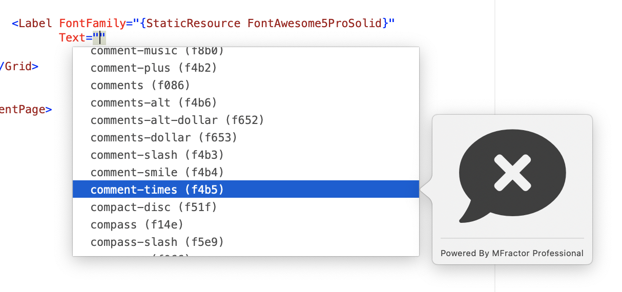


